Introduction
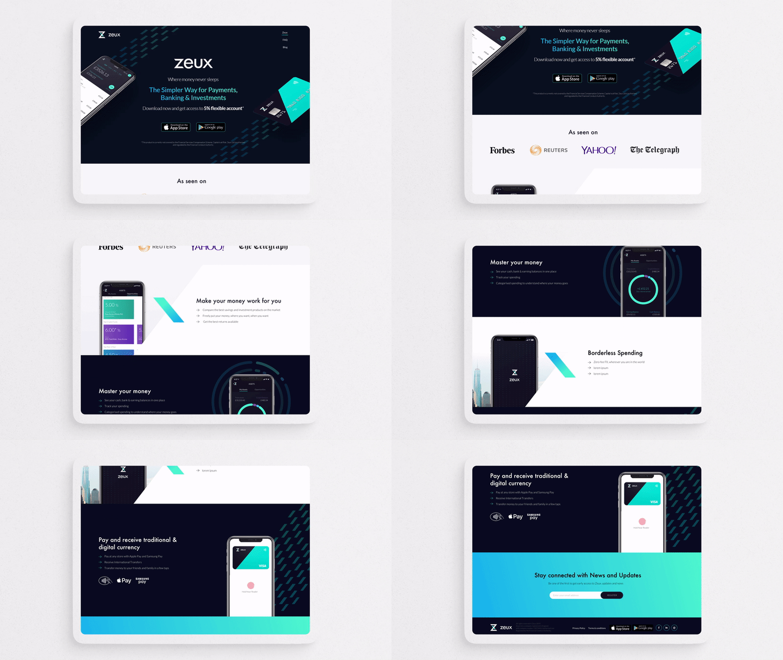
I helped Zeux, a digital banking App, re-design the website. The gradient colours were added in to bring more energy and dynamic to the brand. The pattern was made out of the stroke in the logo of Zeux, aiming to digitalise the brand image whilst maintaining a connection to the visual identity.
My role
Took part in the re-brand, website re-design and mockups for the flyer.
The wedsite display


