Introduction
Kissimmee, as a travel partner, reached out to the Marketing team to collaborate on a campaign, with a dedicated landing page as one of the key deliverables.
AB Testing
Our team reviewed the original design and found it wasn’t user-friendly.
We then carried out an internal redesign and launched both versions as a test.
We then carried out an internal redesign and launched both versions as a test.
Result
The updated design achieved higher click-through and booking conversion rates, along with a lower bounce rate compared to the original version.
We later held a cross-functional session to walk through the redesign decisions and explain the rationale behind each change.
We later held a cross-functional session to walk through the redesign decisions and explain the rationale behind each change.
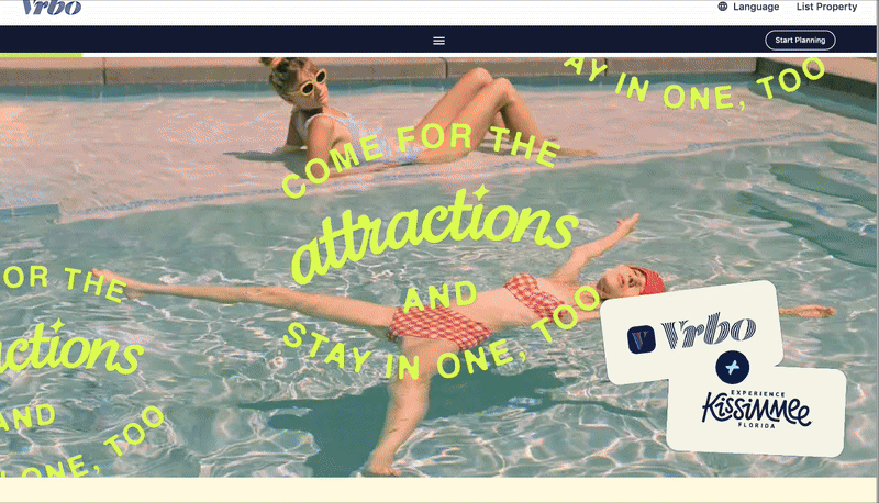
Original design
We conducted an audit of the original design and identified several issues — all stickers were animated which were causing distraction, and the CTA failed to meet accessibility standards, among other oncerns.
![]()
We conducted an audit of the original design and identified several issues — all stickers were animated which were causing distraction, and the CTA failed to meet accessibility standards, among other oncerns.


Analyse
I documented all the design challenges, proposed solutions, and reasons for the high bounce rate. I also led a session with the Marketing team's Creative Directors, where I explained the results of our web accessibility testing and the rationale behind our redesign approach.
The solutions included:
The solutions included:
-
Reducing the number of animated stickers and slowing down their motion to minimize distraction.
-
Introducing the WCAG framework and explaining its conformance levels to the team.
-
Adjusting text and CTA colours to meet WCAG contrast requirements, using approved color variations from the campaign’s visual identity.
- Redesigning the booking card carousel to be more UX-friendly and accessible across devices.


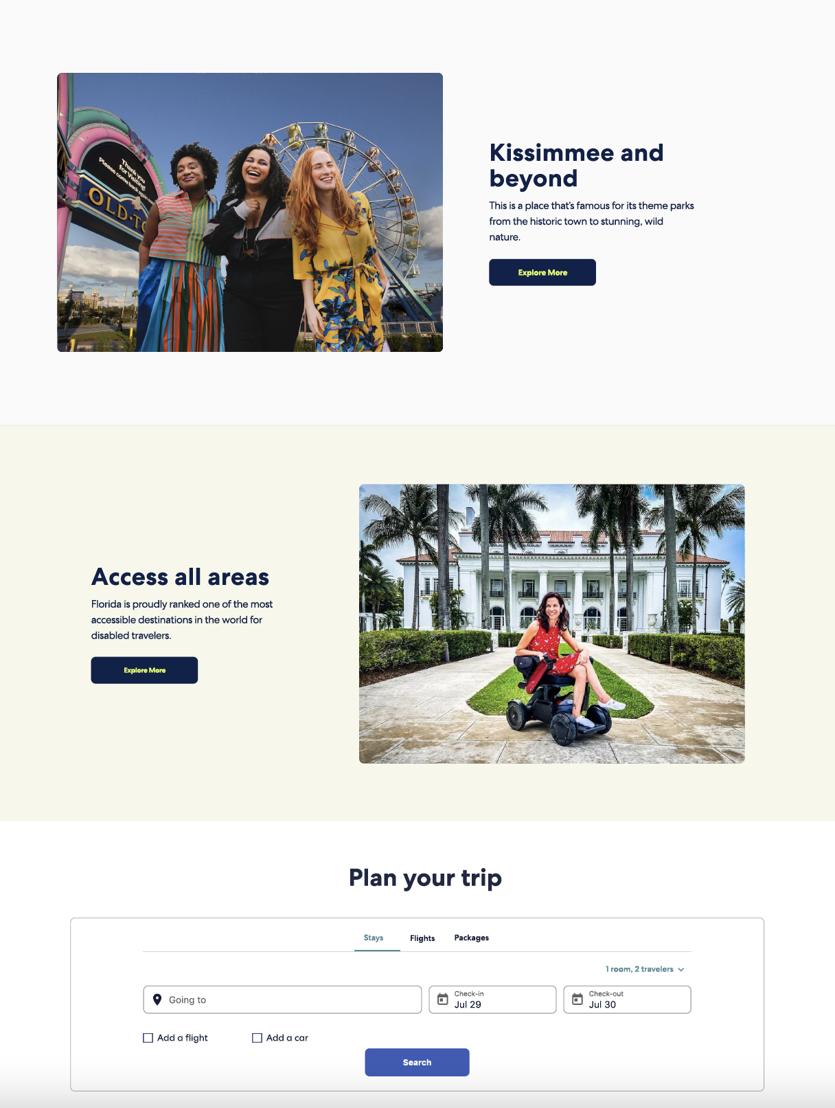
Updated version