Introduction
Anthropologie launched its spring collection digitally. I helped design its new set of homepage and Email campaign.
The ideas
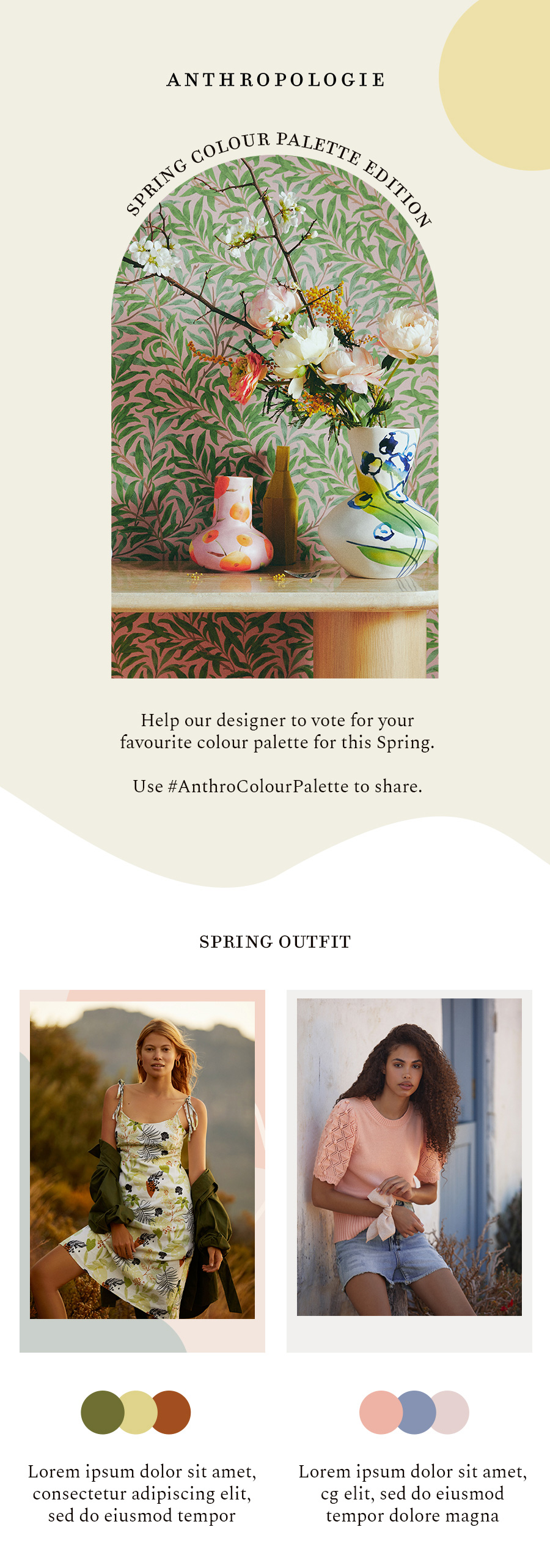
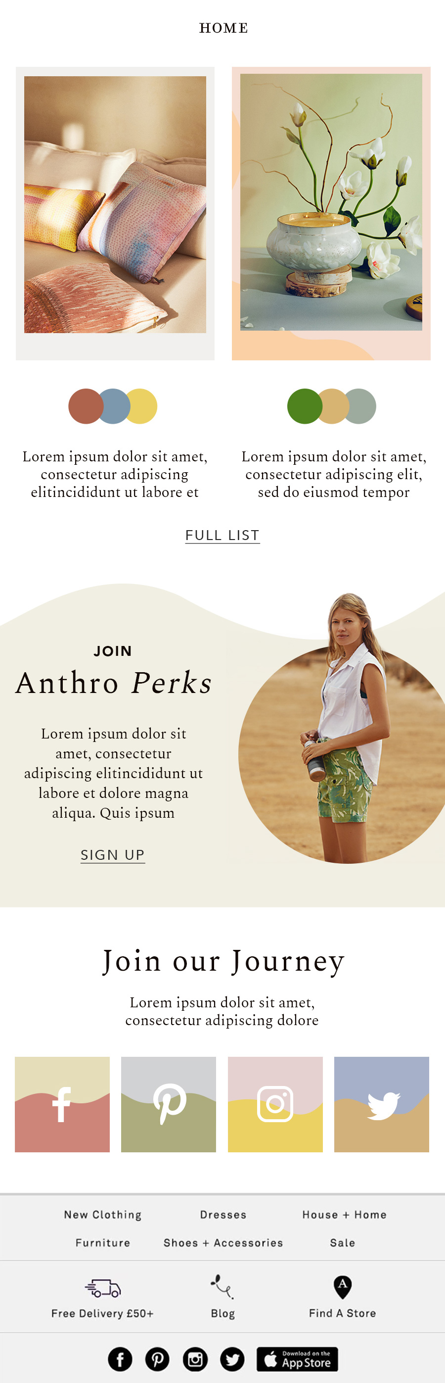
The concept I proposed was to showcase the new collections by combining them with a spring colour palette. After I received the photographs for the new season I saw them as different colour palettes and spring as the canvas.
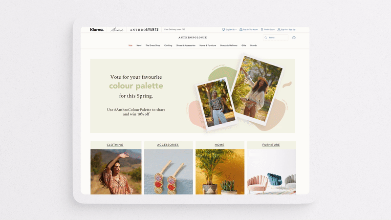
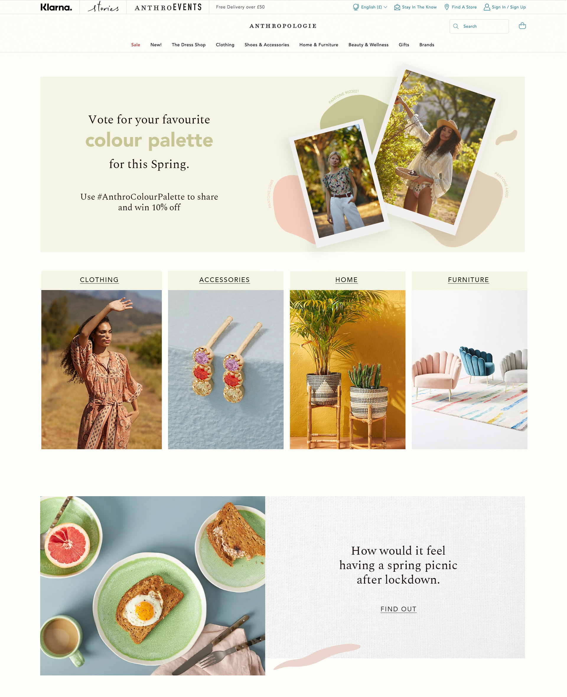
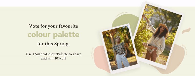
The campaign adopted this concept which ensured people to engage by voting for the colour palette they like and win 10% off, but also to ensure the new products to be browsed on both Email and website.
The campaign adopted this concept which ensured people to engage by voting for the colour palette they like and win 10% off, but also to ensure the new products to be browsed on both Email and website.
Website
Demonstration
The images in the hero banner are “painted” in a spring colour palette, with strokes creating a feeling of chill and gentle. Following that is the 4 main menus showed on the first screen.
The structure was designed to have its own pace, with one horizontal banner and 5 products carousel.
The products’ photo followed a colour tone pace of ‘warm’ and ‘cold’.
The structure was designed to have its own pace, with one horizontal banner and 5 products carousel.
The products’ photo followed a colour tone pace of ‘warm’ and ‘cold’.
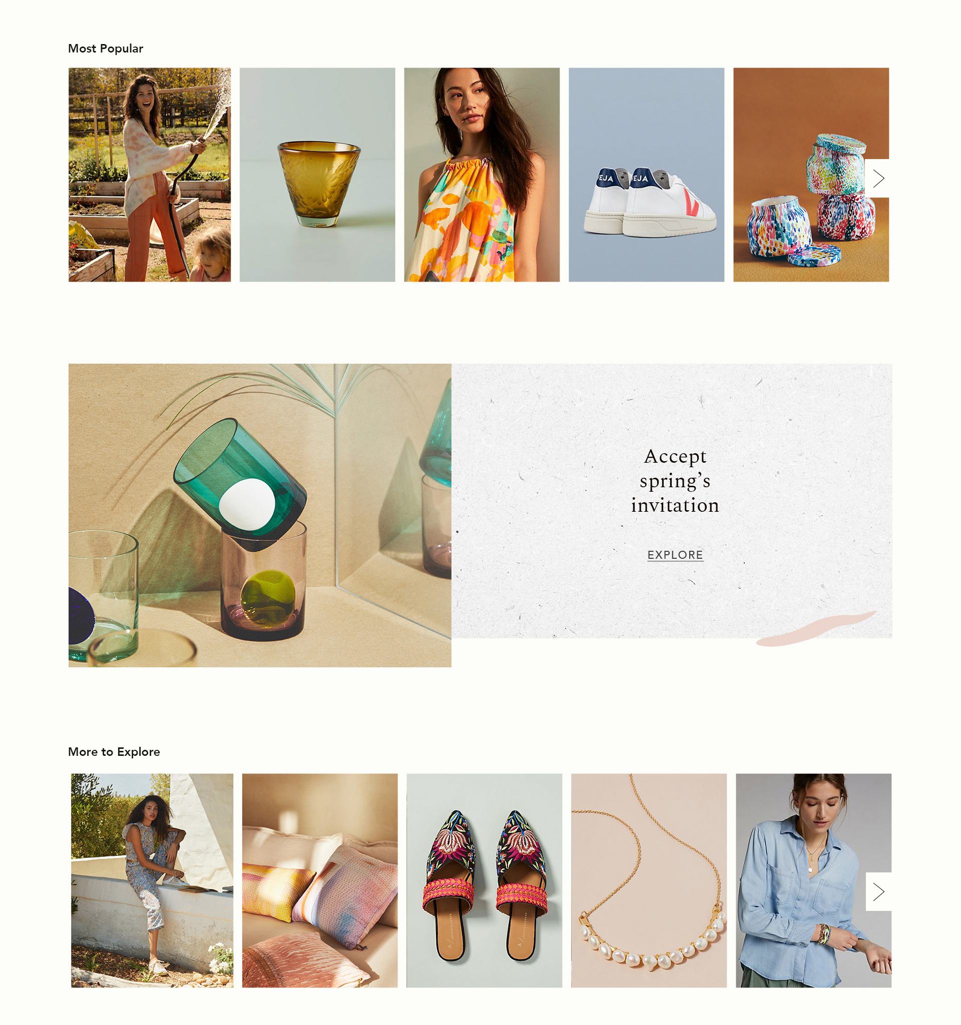
Gif banner - Spring breeze
I also created a gif banner to be placed on the hero banner. The strokes represented a spring breeze flowing from the main title to the photos, indicating a connection between them.
E-mail
The same ideas applied to the e-mail campaign. Instead of encouraging people to purchase, I chose to list the colour palette taken from the photograph. More curve lines were included to separate each section to give it a more dynamic and fresh feminine style.