Introduction
Xinshang - An e-commerce c2c marketplace for second hand luxury goods.
I joined Xinshang e-commerce as a visual designer.
It enables young fashionable people to sell and purchase luxury goods with low commission fees all conveniently via a dedicated mobile app.
To assure the luxury goods sold are high quality and authentic, Xinshang provides a free goods authentication service for all customers. This immediately safeguards its reputation and ensures only authentic goods are circulated within the market.
My role
As a senior visual designer with limited experience on UI, I did my job in a standard way:
1. Receive the brief (objectives) from product manager
2. Align the priority with designers (UI, UX, graphic designers)
3. Manage the team
4. Work delivered
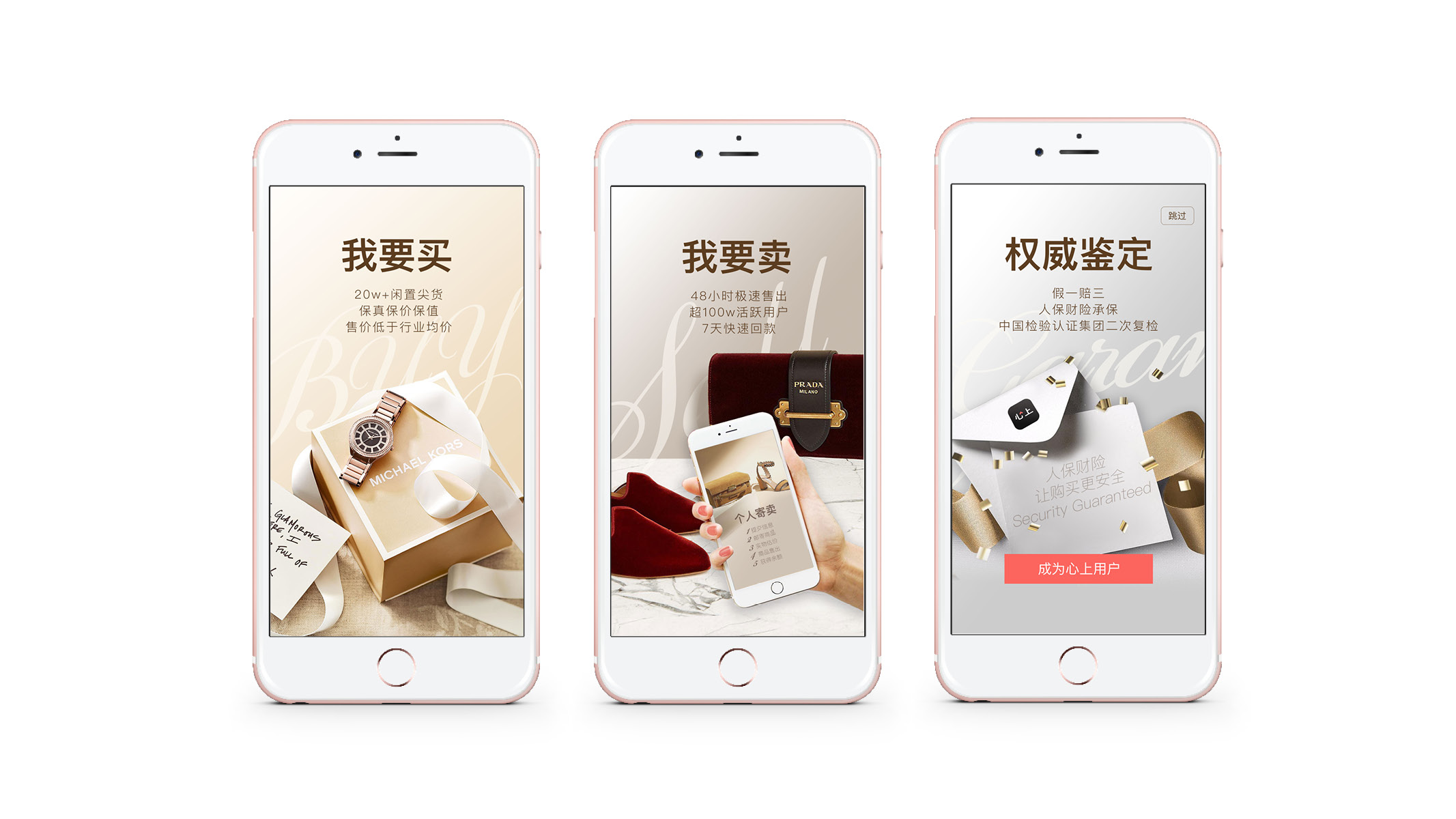
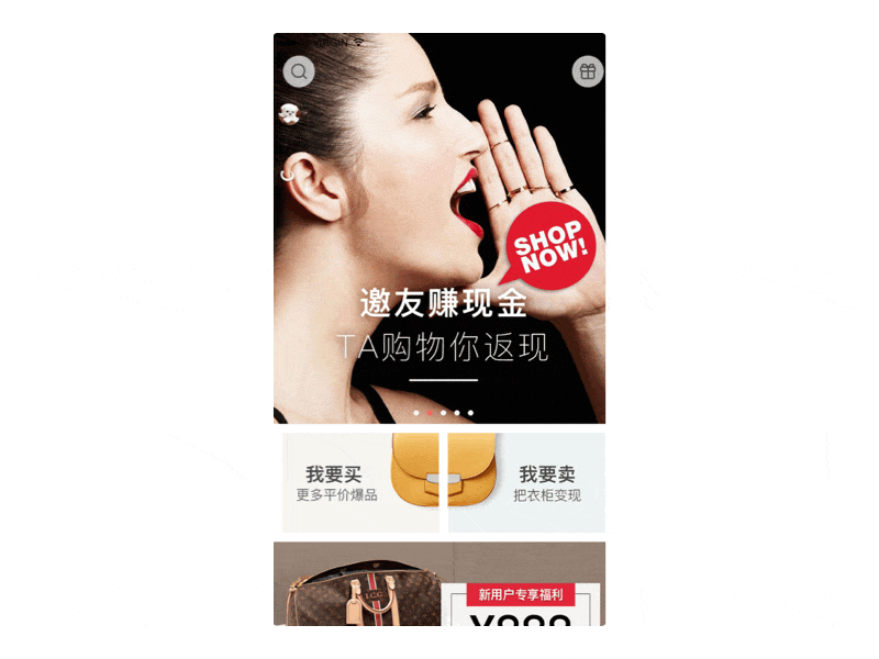
Very first version we did:
1. Receive the brief (objectives) from product manager
2. Align the priority with designers (UI, UX, graphic designers)
3. Manage the team
4. Work delivered
Very first version we did:
Changing for the better
Low conversion led us to a new level
Low conversion led us to a new level
One month on, I took notice that the banners we produced lead to a low conversion rate. Concerned I brought it to the attention of the key managers who agreed and set a change in motion. I was given the responsibility to be involved in meetings to help set up goals, create customer personas, etc to meet our new targets.
Setting new goals
Raise conversion lift
Key challenges for the design team
1. Aggresssive deadline
2. Limited resource
3. Lack of a brand image
Making it happen
Collecting customer data and research
1. Analysing purchasing behaviour
With the customer-service team we reviewed the data to find the Top 5 brands that customers had purchased or ordered in addition to other data that help their decision making.
2. Our customers know best
We launched an online survey by showing different types of design style to get a better understanding about what styles people preferred.
3. Direct customer input
We gave the opportunity for our customers to provide valuable feedback by inviting them to come and join our focus meetings.
Based on the user research 2 customer personas were created.
Insights
Resolving problems with my design thinking
Resolving problems with my design thinking
1. The brand is our foundation
To develop the brand we needed to understand who the customers were. From our research we knew they were young, fashionable people with a well-educated background who enjoyed social networking, being active and liked to live a good lifestyle. This gave guidance for the visual design team to develop a new set of brand guidelines to appeal to our target audience.
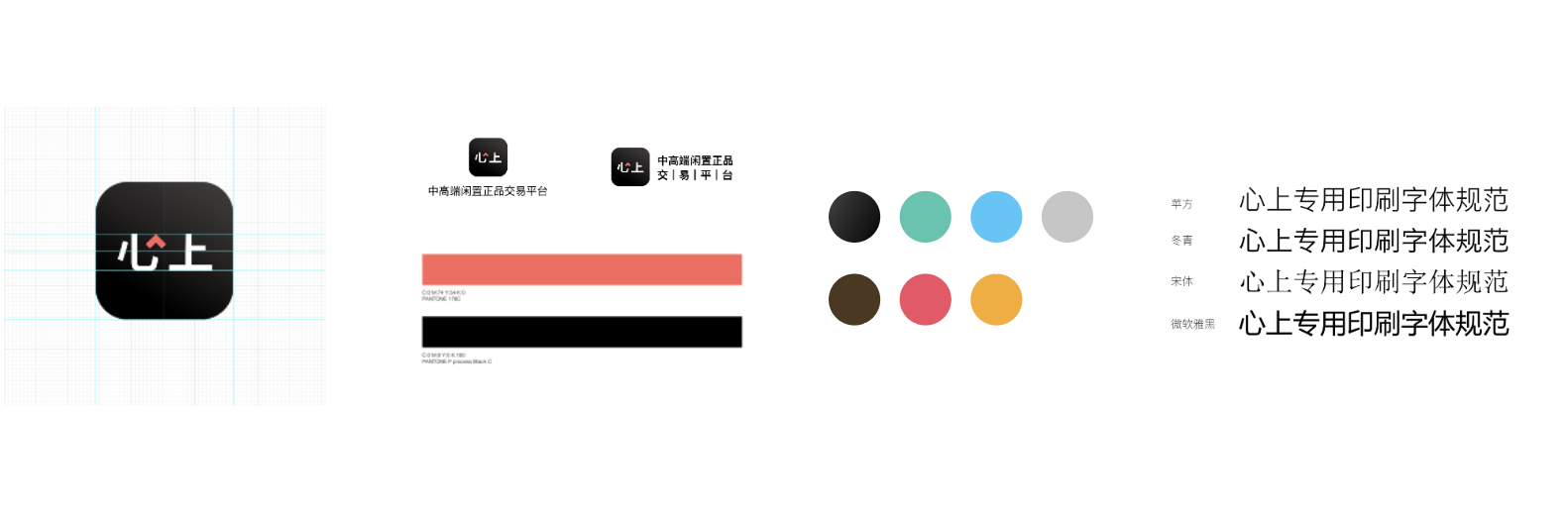
2. Visual identity expand (Part of the visual identity)
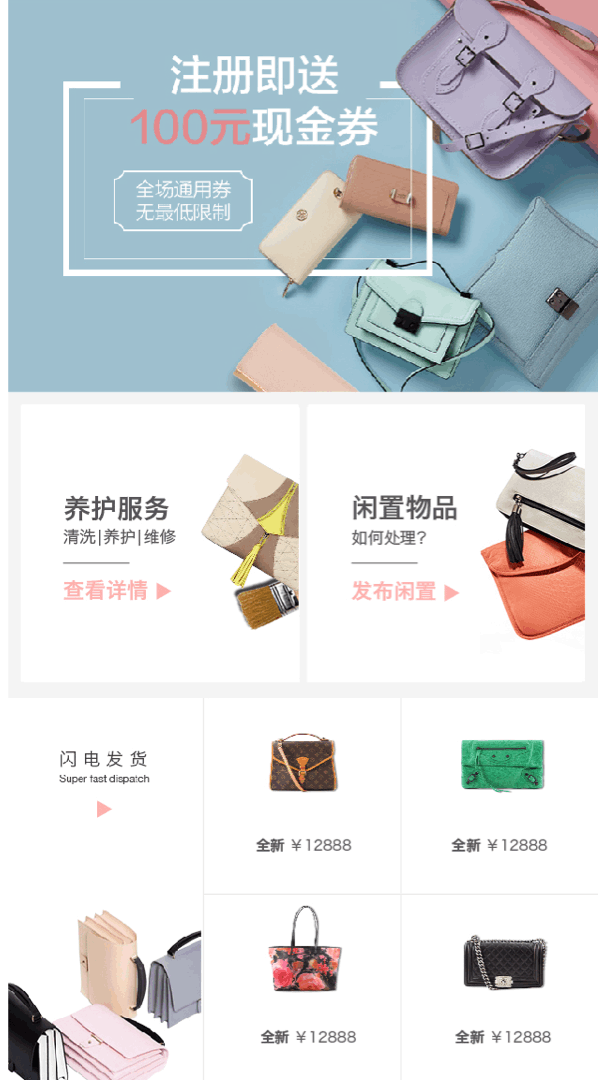
![]()
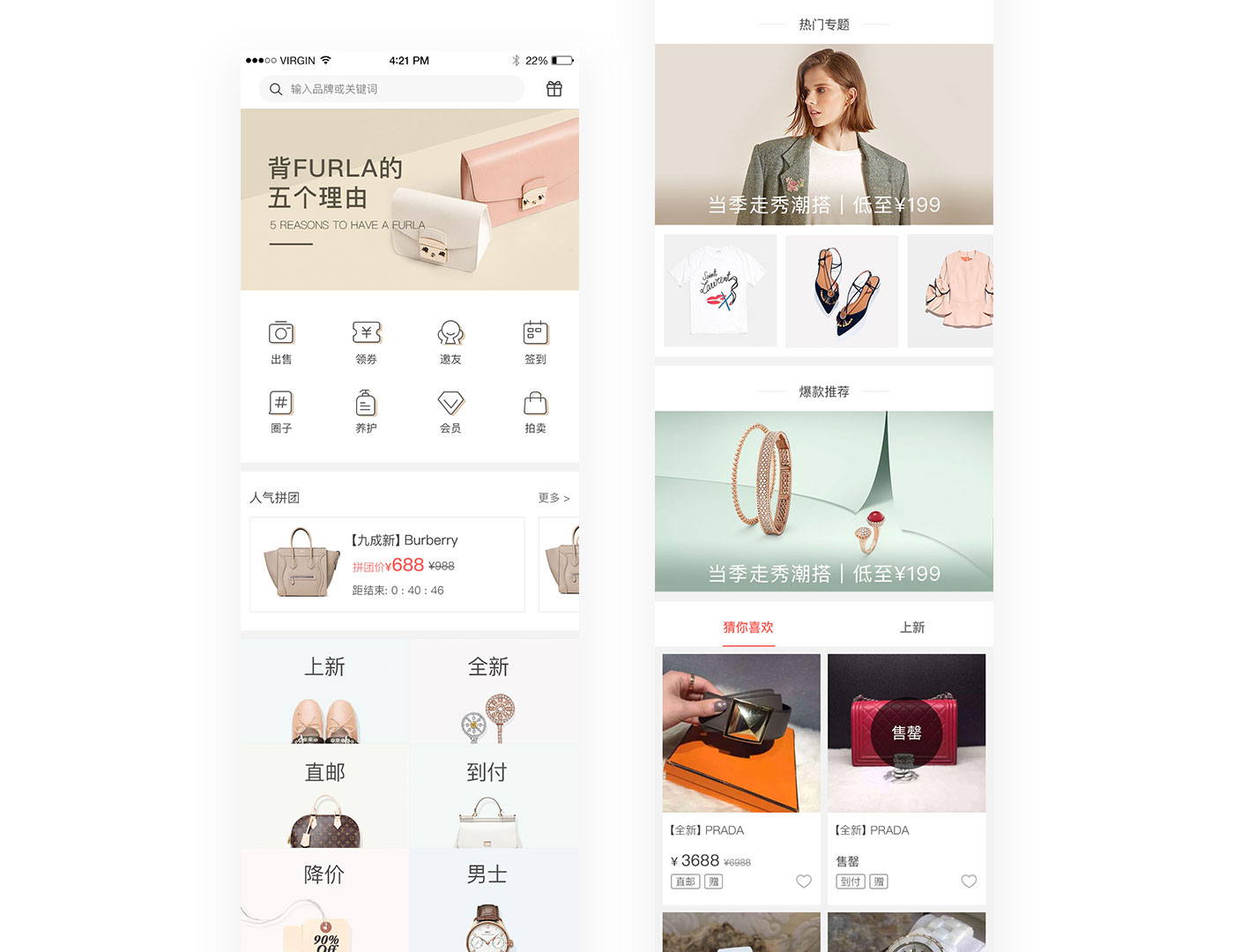
2. Updated Home page
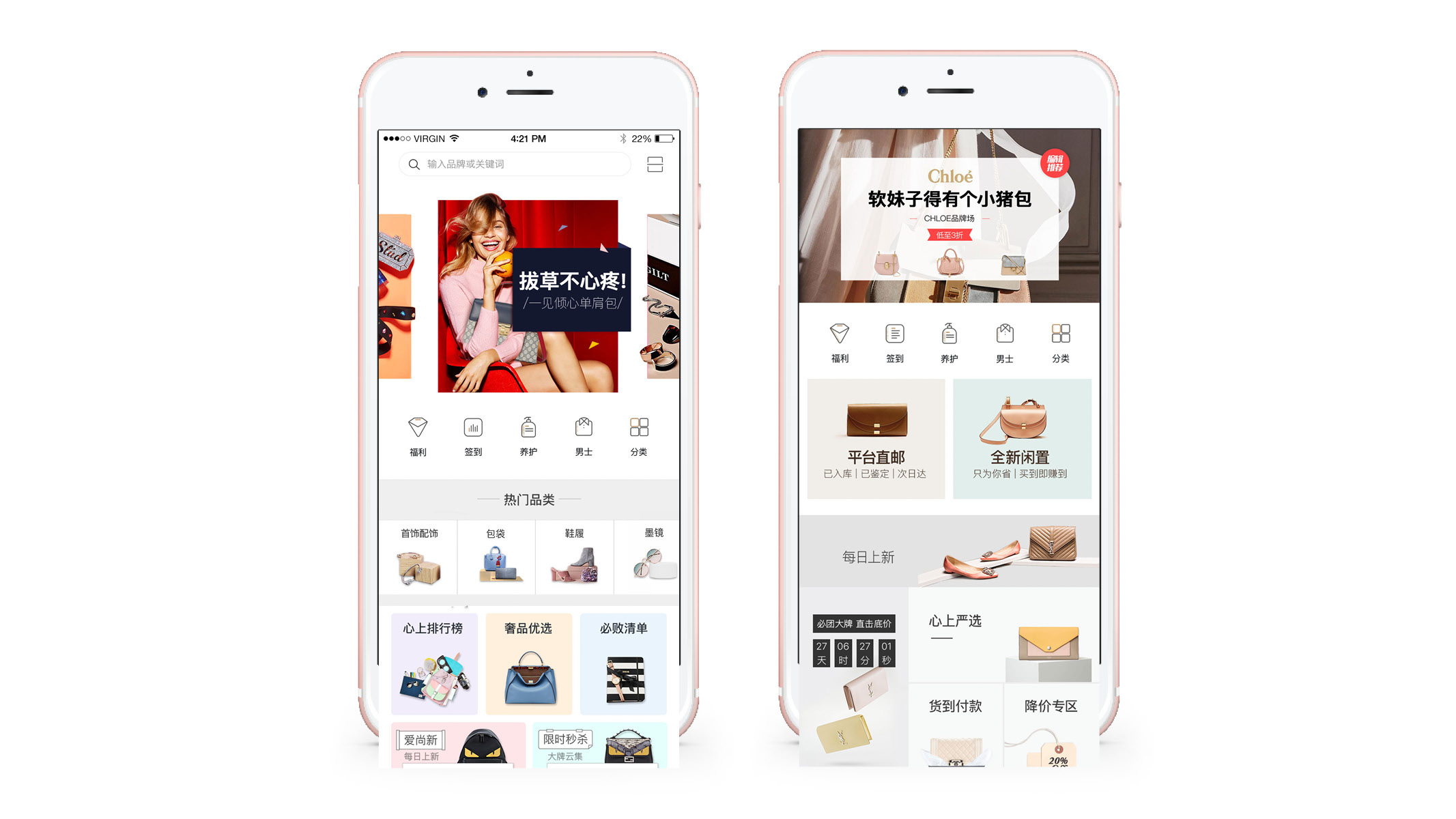
A new series of visual design came out, we did a/b test for the below home page design and the version on right hand side stoodout
![]()
![]()
![]()
To develop the brand we needed to understand who the customers were. From our research we knew they were young, fashionable people with a well-educated background who enjoyed social networking, being active and liked to live a good lifestyle. This gave guidance for the visual design team to develop a new set of brand guidelines to appeal to our target audience.
2. Visual identity expand (Part of the visual identity)
2. Updated Home page
A new series of visual design came out, we did a/b test for the below home page design and the version on right hand side stoodout


We stayed motivated and optimistic
With further analysis, we soon evolved our style as the data highlighted that the male customer segment could potentially be a big market. Taking a step back from our initial colour schemes we used more neutral tones and male-oriented colours when talking to this audience.
What we did:
1. Decrease the use of bright colour, and toned down the saturation of the colour on each banner
2. Created a new tone and messaging based on "Everyone deserves a luxury bag, each bag deserves a second chance" and create an aspirational atmosphere to aspire to "a good life style".3. New front pages designed for testing
We developed the following 2 options:
For the above options, the same styles were maintained, but the UI styles were based on a different set of wireframes. The 1st option with bigger image-exposure were more artistic and fashion-led in comparison to the latter one, which was more functional and practical.
Instead of choosing one, we decided to run a/b test to test both versions to determine the best one. Each version was launched for 2 months.
We had internal vote + user feedback through customer service team to collect reviews regarding the user journey / design style, etc., we also checked CTR in banners and buttons in landing pages.
In the end, the 1st option proved to be preferred, which was designed based on its functionality, although we all liked the 1st option, we all now understood the reasoning behind "form follows function", a true real-life case study.
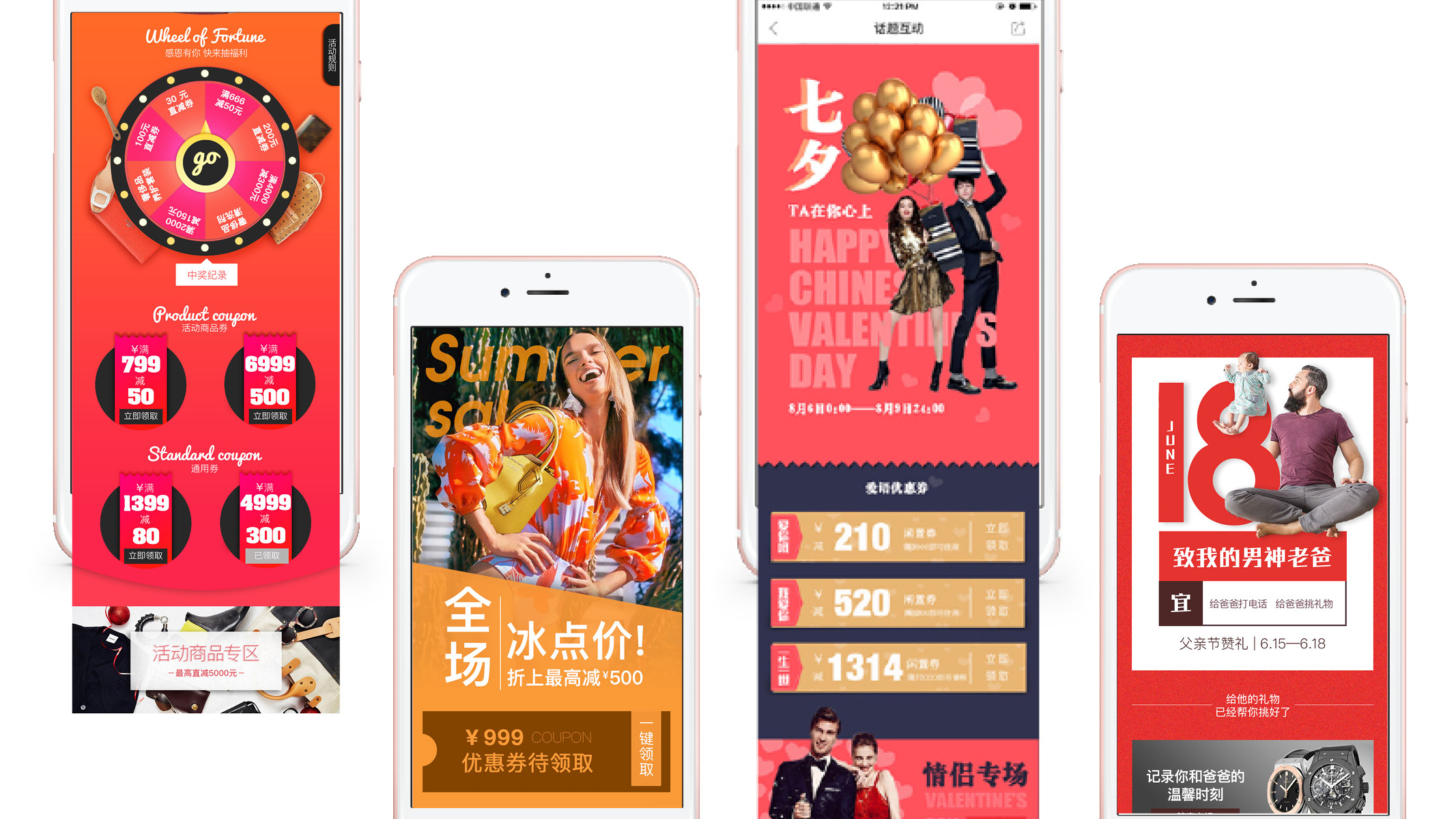
Marketing assets
For the design of our h5 and landing pages were more marketing-led, so the style was more exaggerated to make them more eye catching. The homepage designs remained elegant with less elements and decorations.
(In China, the approach can be slightly different in terms of maintaining the consistency of a brand, paying more attention to the operational, functional areas than the branding effect therefore visual style needs to be adjusted according to the different use case).
Examples:
(In China, the approach can be slightly different in terms of maintaining the consistency of a brand, paying more attention to the operational, functional areas than the branding effect therefore visual style needs to be adjusted according to the different use case).
Examples:


With all the team members hard work and continued good results, Xin Shang successfully raised 2 rounds of investment funding in 1.5 years.
Latest versions
We have got more experiences on the user joureny, testing, design desicions, etc. in the later versions