Introduction
I was asked to improve the visual design of the home page of a luxury e-commerce app in China. Customer clickthrough rates had been reducing, it was concluded that the source of the impact was through recent updates to the layout and design of the homepage.
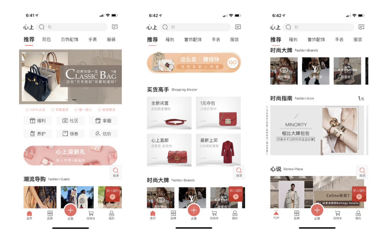
The old design:
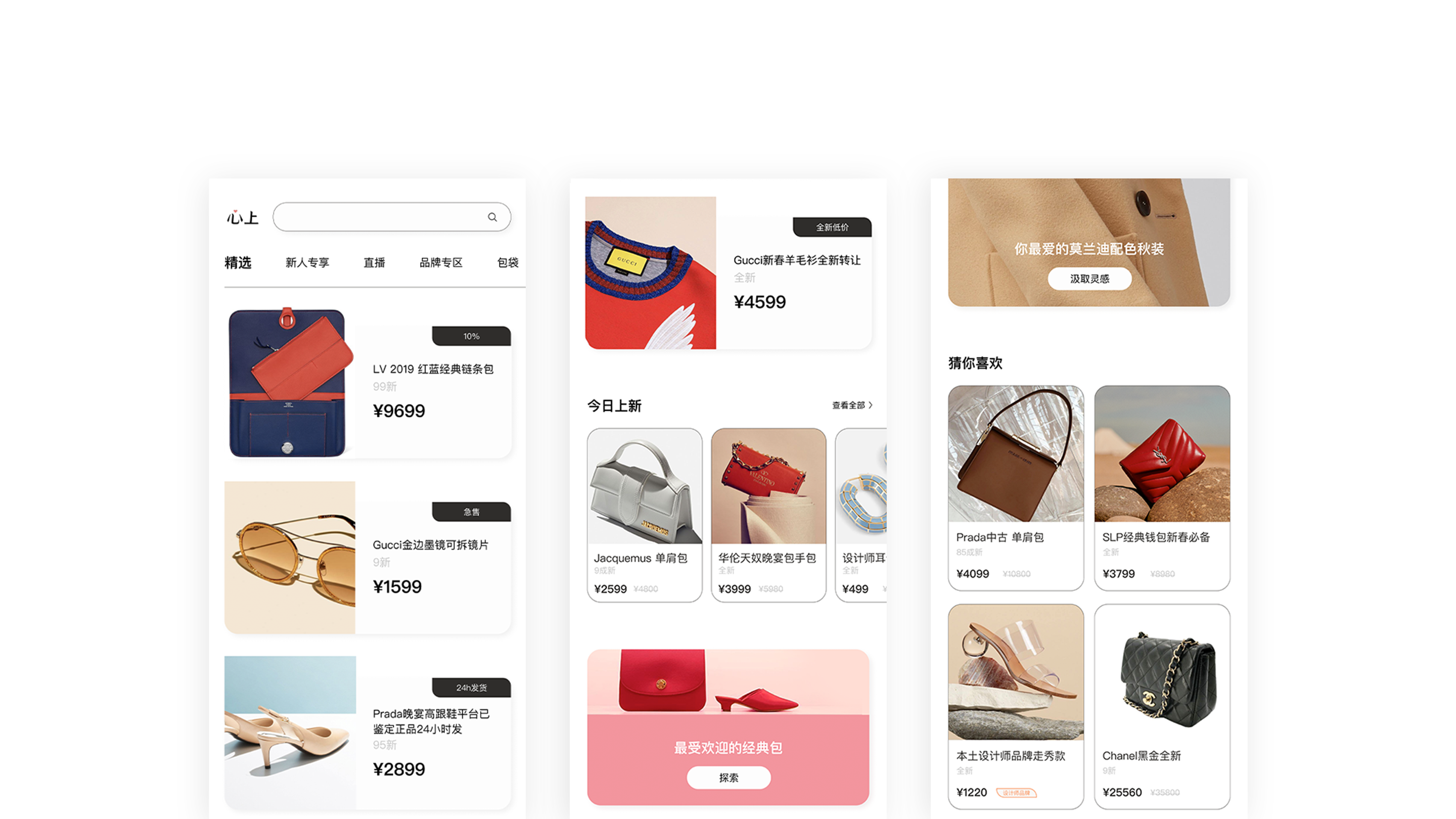
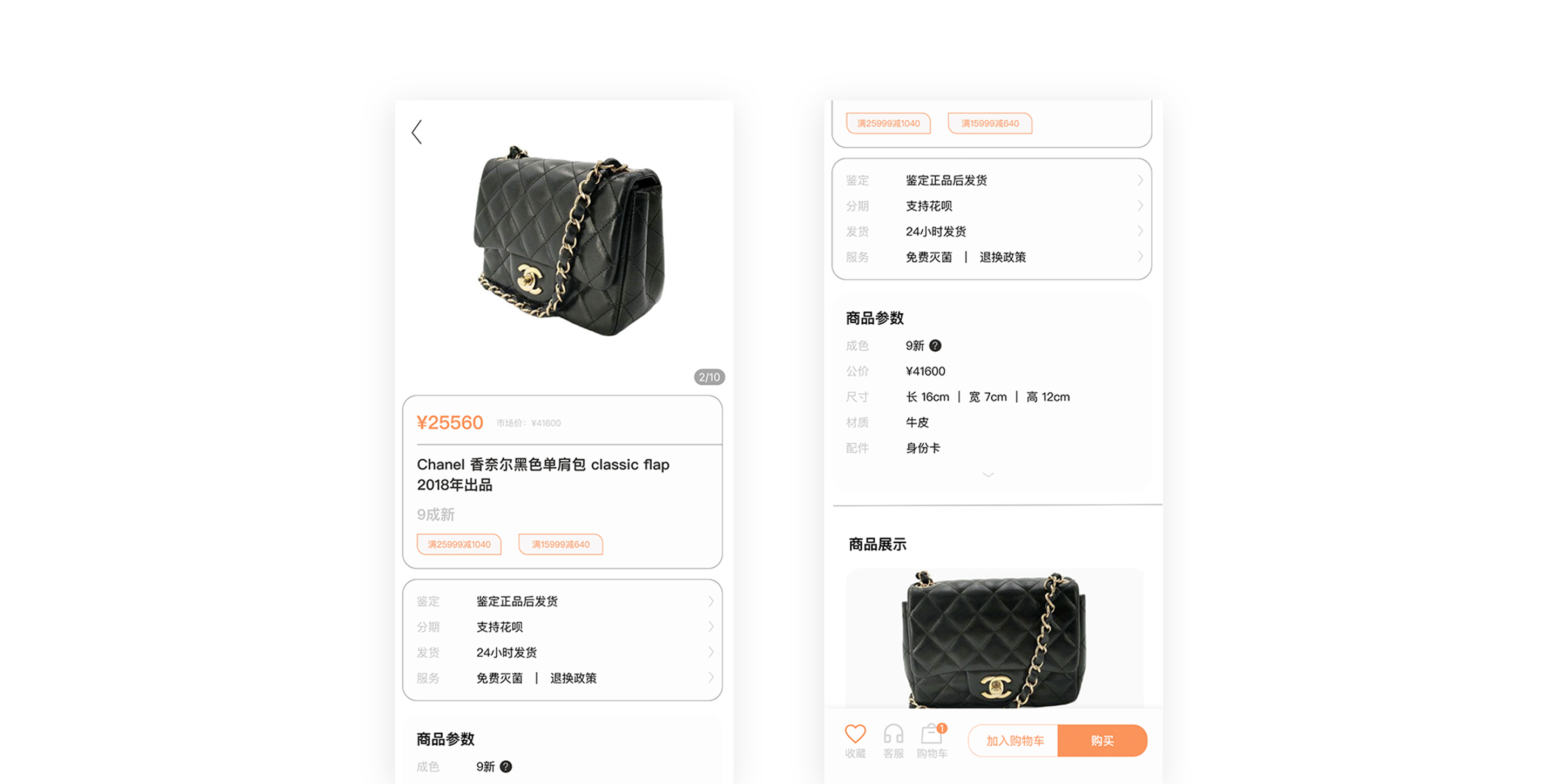
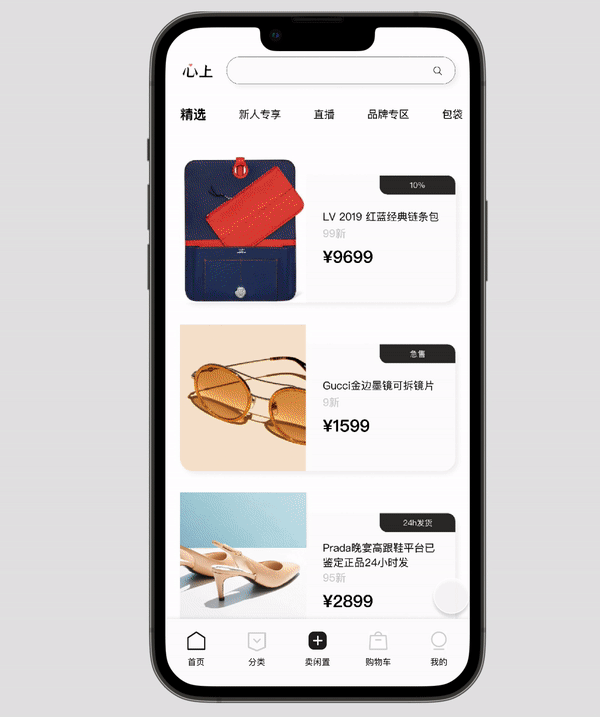
The new design:
My role: Design lead for both UI and graphic parts.
My role: Design lead for both UI and graphic parts.
The process to the final outcome
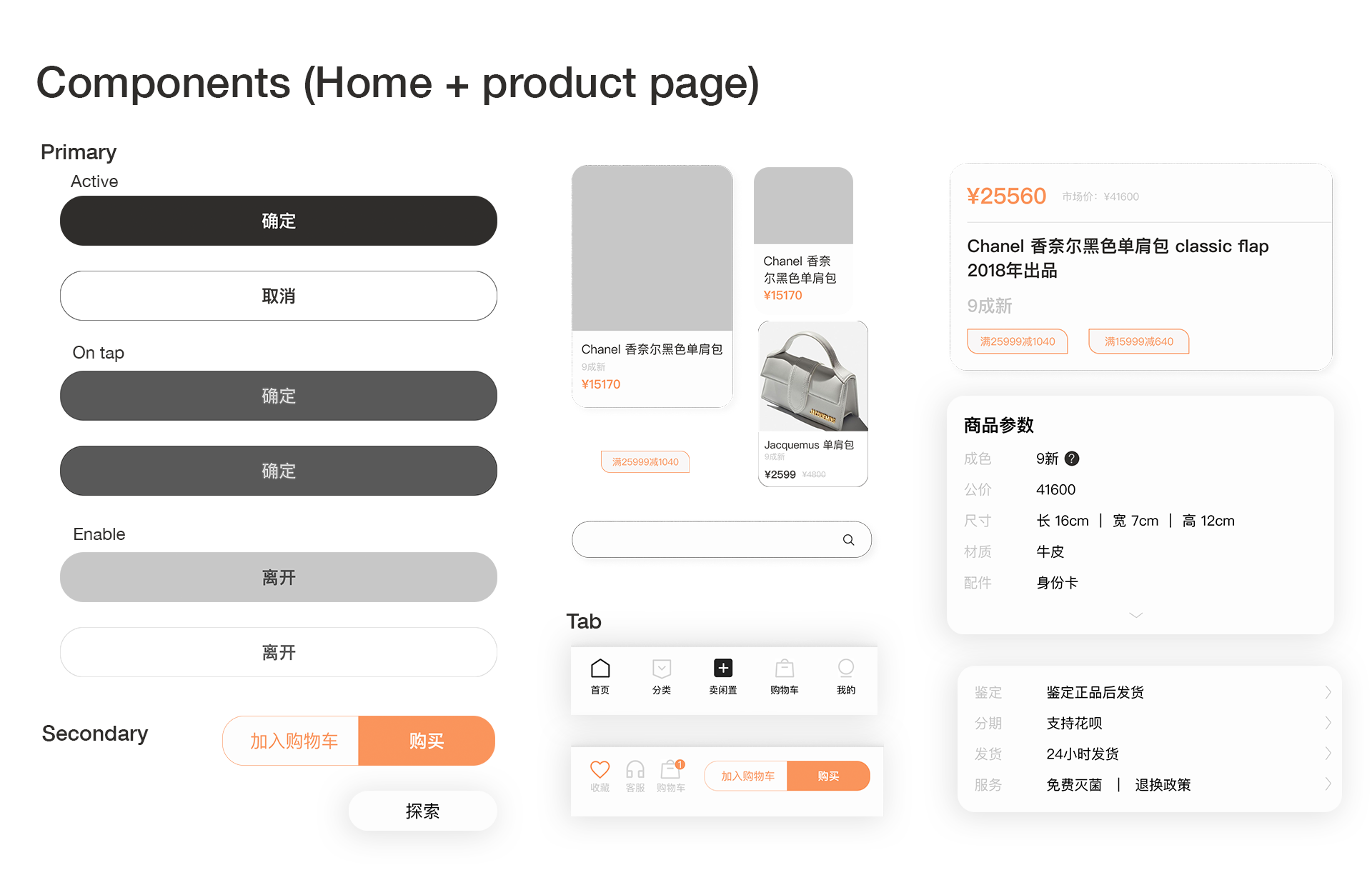
Identify the challenges > Solutions > Reserach and user persona > Moodboard > Learn the guideline > Wireframe discussion > UI Design (components: buttons, lables, cards, etc) > UI design based on wireframe
Challenge
The first draft of UI design was finished based on an updated wireframe.
1. Too many 'focus areas' which in turn offered too many options and distractions for the customers resulting in the visual elements being too busy and complex.
2. Unconsistent design language3. Wordy discriptions on product page
3.1 The platform allowed sellers to upload their own product photos and part of the cause was that they had no professional photographic skill to take high quality pictures. This impacted the overall brand's perception of 'luxury goods'.
3.2 Further to this, customers' user preference allowed them to select a product brand, which would always display these poor product photos on the home page, giving Xinshang reduced control of its perceived quality.
4. Tight deadline: 2 weeks.
Solutions
After realising the problems, I contacted some departments and aksed if there would be a way to get the pictures on homepage in control. Here were my solutions:
1. Build a pool to contain those uploaded cluttered pictures first
2. Then the manually selected pictures with clean and white background could be put on homepage preferentially
3. Ideally, a third-party company could be found to take care of the rest of the pictures - get them all photoshopped, but considering the amount of pictures, i wasn't sure about it
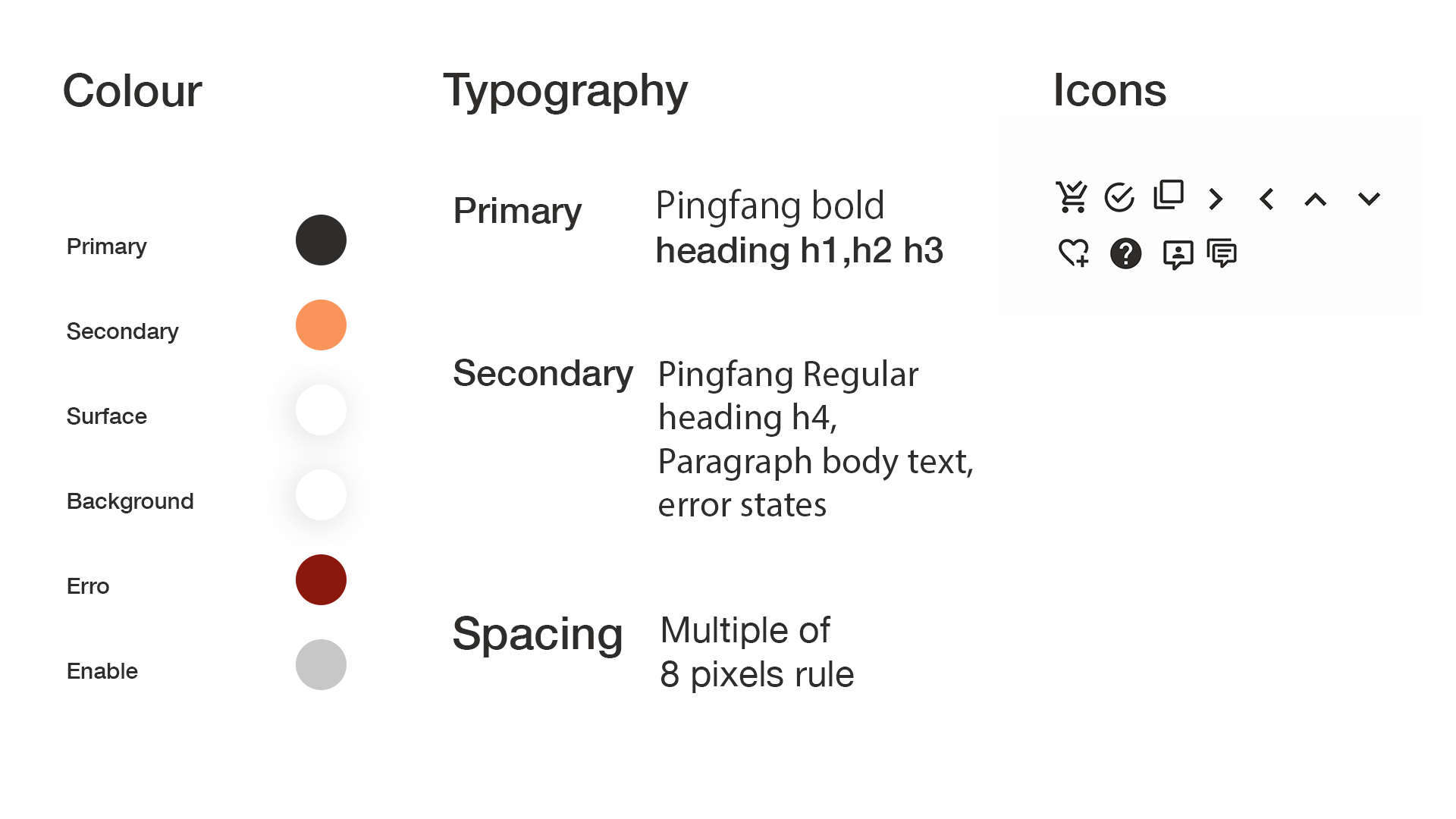
4. Design system
5. Content optimisation
1. Build a pool to contain those uploaded cluttered pictures first
2. Then the manually selected pictures with clean and white background could be put on homepage preferentially
3. Ideally, a third-party company could be found to take care of the rest of the pictures - get them all photoshopped, but considering the amount of pictures, i wasn't sure about it
4. Design system
5. Content optimisation
User Persona
Due to a low conversion in the old version I started to collecting customer data to finish the user persona:
1. Analysing purchasing behaviour
With the customer-service team we reviewed the data to find the Top 5 brands that customers had purchased or ordered in addition to other data that help their decision making.
2. Our customers know best
We launched an online survey by showing different types of design style to get a better understanding about what styles people preferred.
3. Direct customer input
We gave the opportunity for our customers to provide valuable feedback by inviting them to come and join our meetings.
Based on the user research 2 customer personas were created:
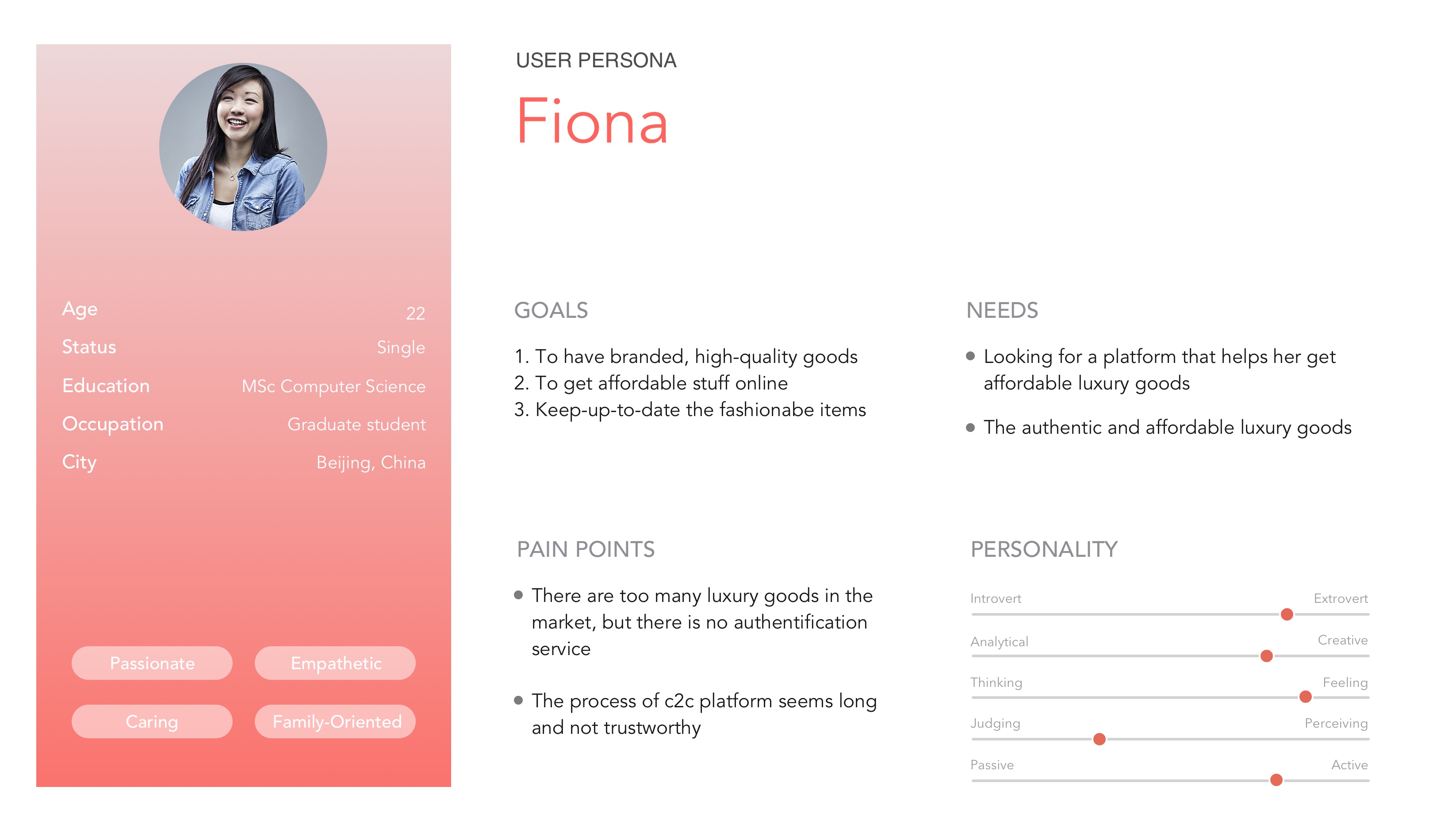
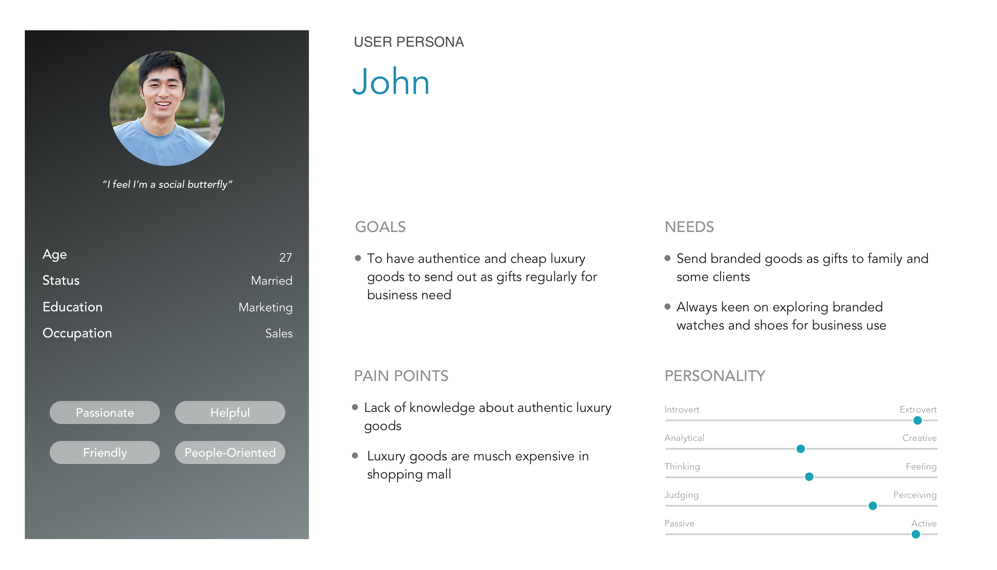 Keywords: affordable, high-quaity, authentic, business, gifts.
These helped us make the right decision on what to be emphasis in a product design and visual design level.
Keywords: affordable, high-quaity, authentic, business, gifts.
These helped us make the right decision on what to be emphasis in a product design and visual design level.Design system
Retrospect
What i'd do differently
1. I would rebuild the brand guideline due to the lack of design consistency so far, it is always a foundation for a brand.
2. The fast-paced environment and the rigid design process have limited our creativity . i would spend more time communicating with people, find out what users need, instead of drowning in my own world and design ideal product based on my own preference.
2. The fast-paced environment and the rigid design process have limited our creativity . i would spend more time communicating with people, find out what users need, instead of drowning in my own world and design ideal product based on my own preference.