About this ongoing project
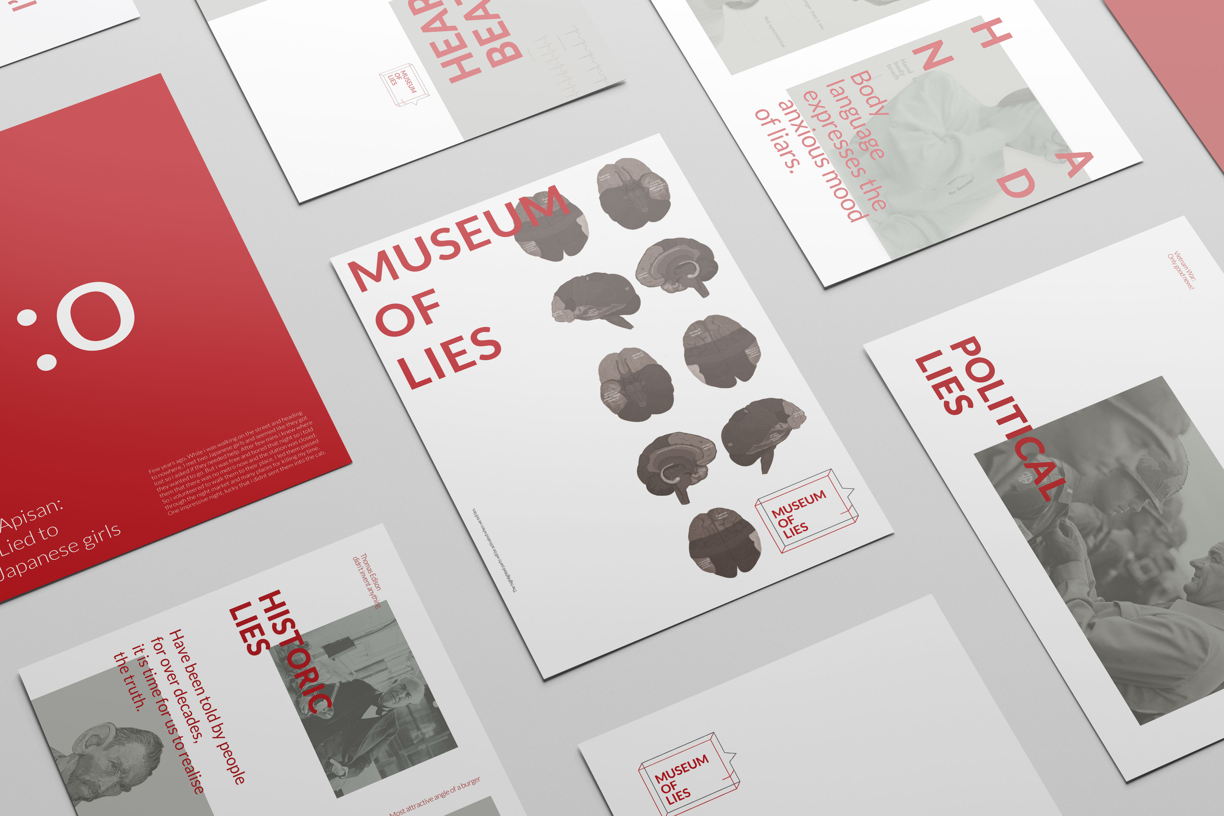
With the modern age of technology and media we are heavily influenced by what we read and by what we see. I explored the boundaries of this concept by developing a series of work to illustrate whether graphic design can mislead an audience.
The aim is to make people believe that there is an event and place called the “Museum of lies”, which in reality does not exist.
The aim is to make people believe that there is an event and place called the “Museum of lies”, which in reality does not exist.
Key parts of the project
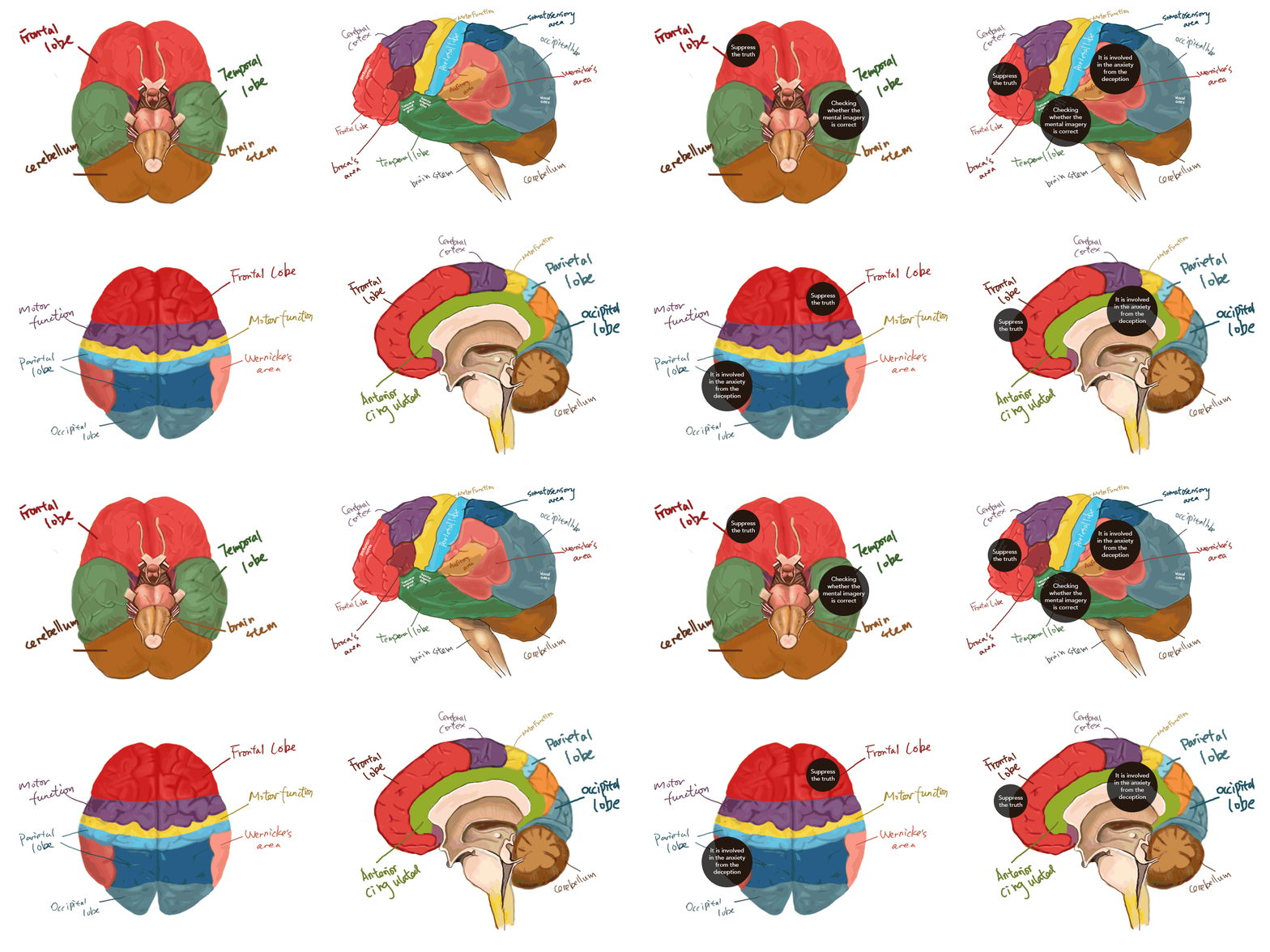
I first started exploring how brain works when people tell lies. I drew 4 dimentions of a brain to demonstrate when people tell lies the areas in black dots would be activated.
Extensive Research
To maintain an objective perspective, data was collected from a broad range of countries and age.
This showed some interesting results:
![]()
From the results, more than 50% of participants tell lies (including white lies), and the question "Do you sometimes ask about others' gossip or secrets?" with the high majority voting "Yes". (meaning this is a project worth doing.)
This showed some interesting results:

From the results, more than 50% of participants tell lies (including white lies), and the question "Do you sometimes ask about others' gossip or secrets?" with the high majority voting "Yes". (meaning this is a project worth doing.)
Visualise lies
I tried to connect these types of lies to different colours by creating colour cards to help myself better understand the category of lies.
![]()
![]()
The first colour represents selfish lies whilst the fourth colour defines lies that partly help others and ourselves. They both have lower degrees of saturation, which enable them to stay in the grey area. Besides, there is higher brightness in the fourth colour, which shows that we all gain benefits from this type of lie. Meanwhile, less brightness is added in the first colour in order to express a depressed mood - after all, it is a selfish lie.

The first colour represents selfish lies whilst the fourth colour defines lies that partly help others and ourselves. They both have lower degrees of saturation, which enable them to stay in the grey area. Besides, there is higher brightness in the fourth colour, which shows that we all gain benefits from this type of lie. Meanwhile, less brightness is added in the first colour in order to express a depressed mood - after all, it is a selfish lie.
The logo
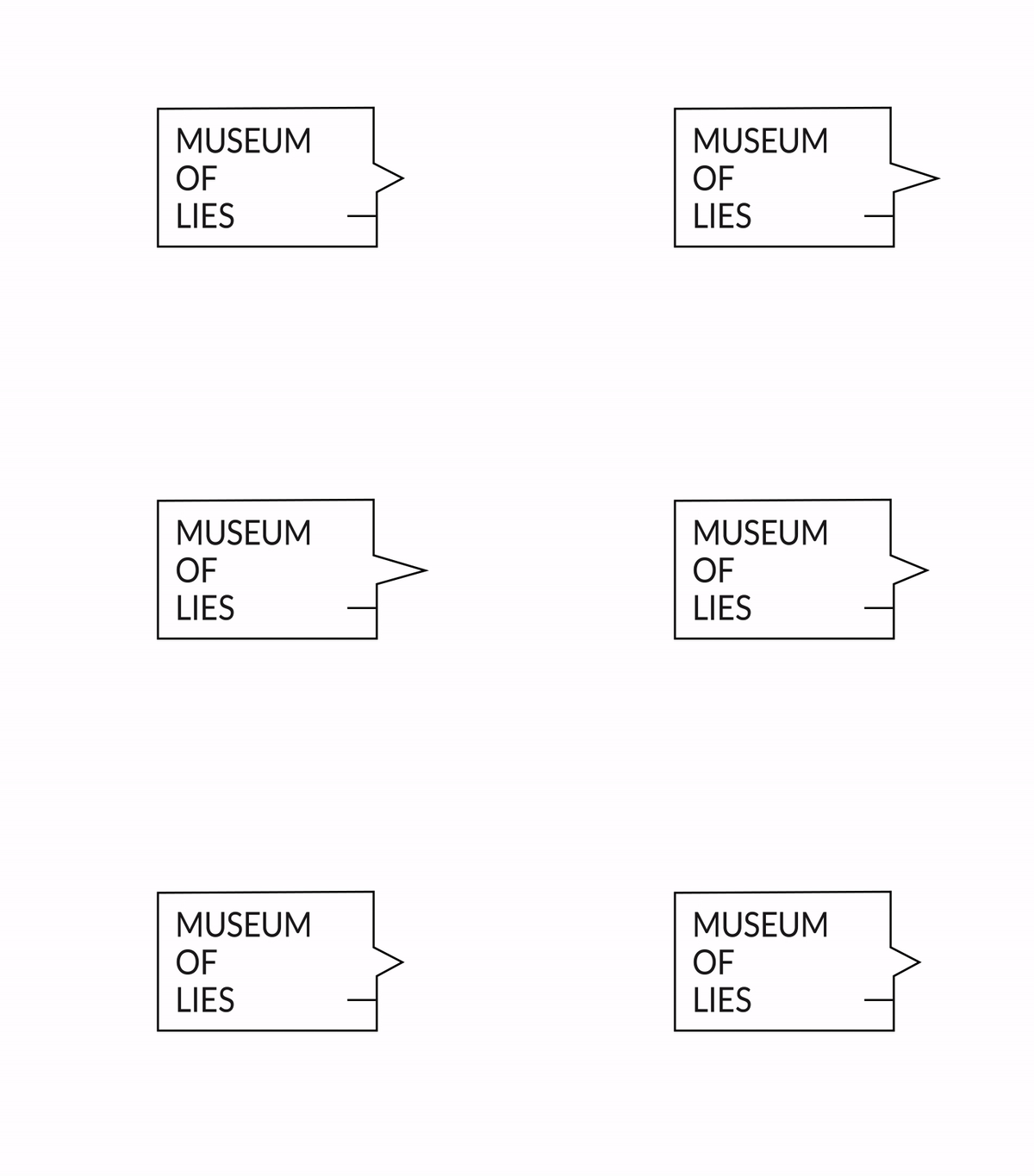
I made this draft for fun to indicate "nose gets longer when lying",also got inspired by it in the end.
![]()
![]() Dialog box + side faces + Pinocchio's nose + different dimensions.
Dialog box + side faces + Pinocchio's nose + different dimensions.
 Dialog box + side faces + Pinocchio's nose + different dimensions.

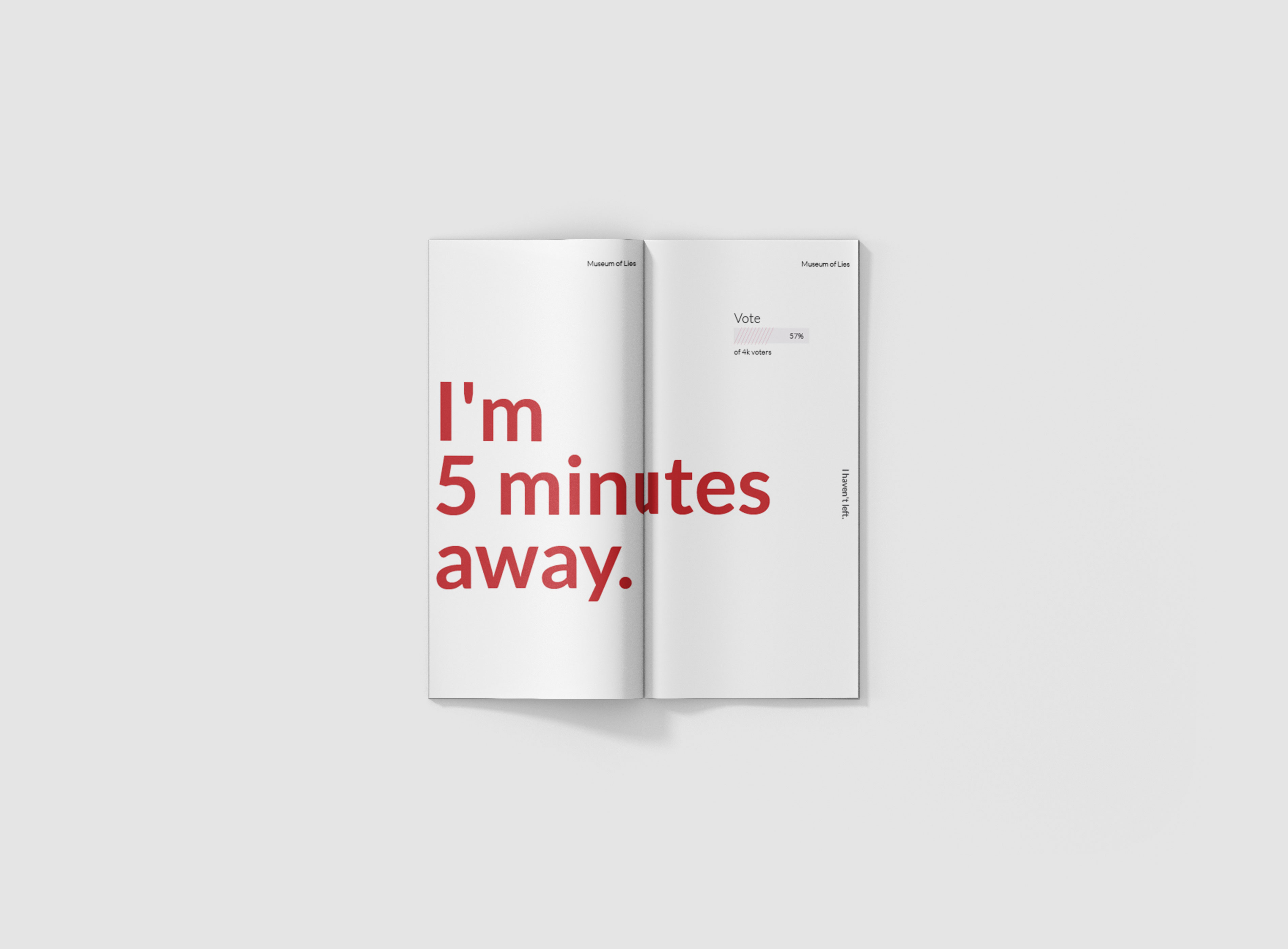
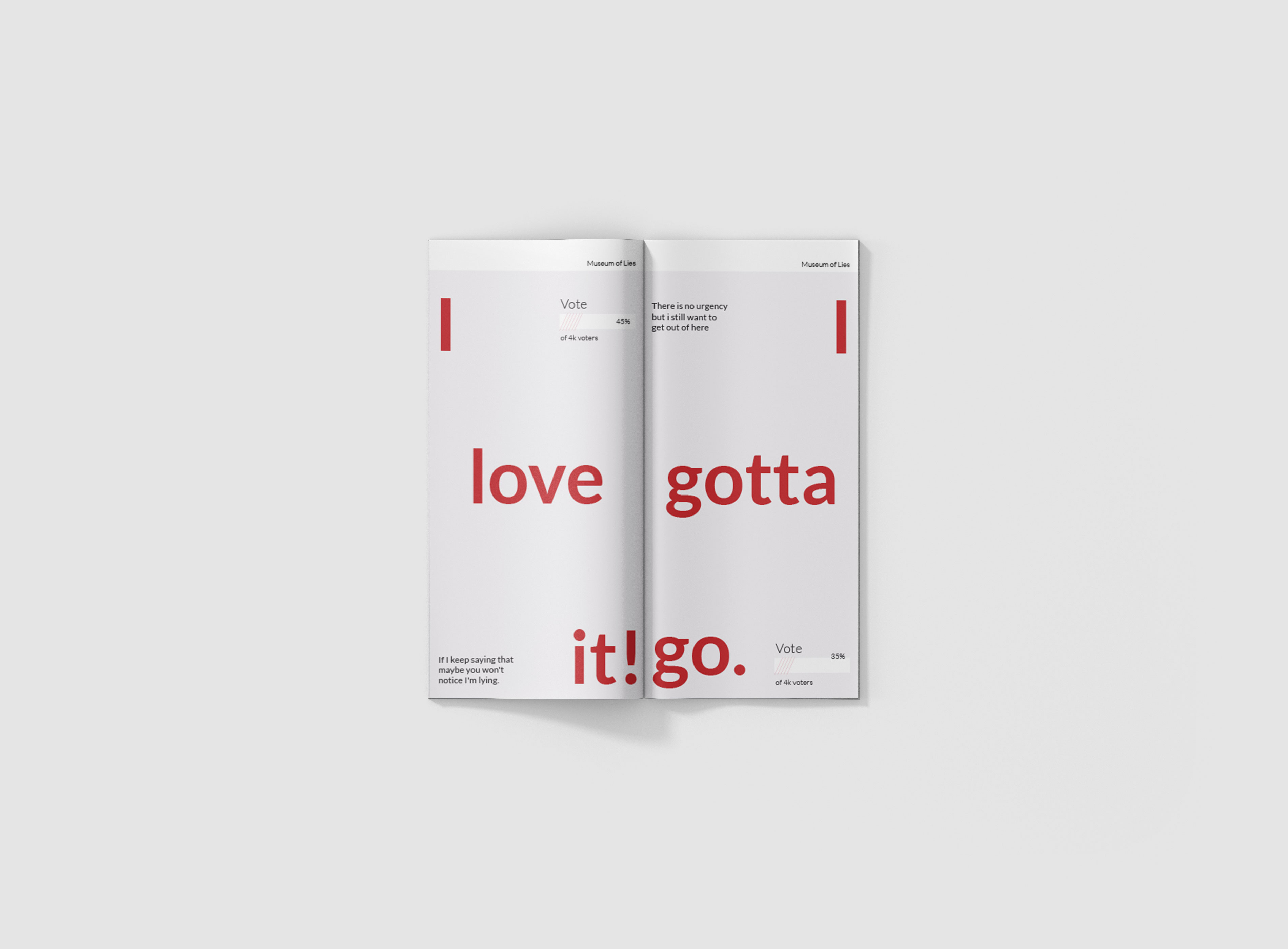
DL brochure
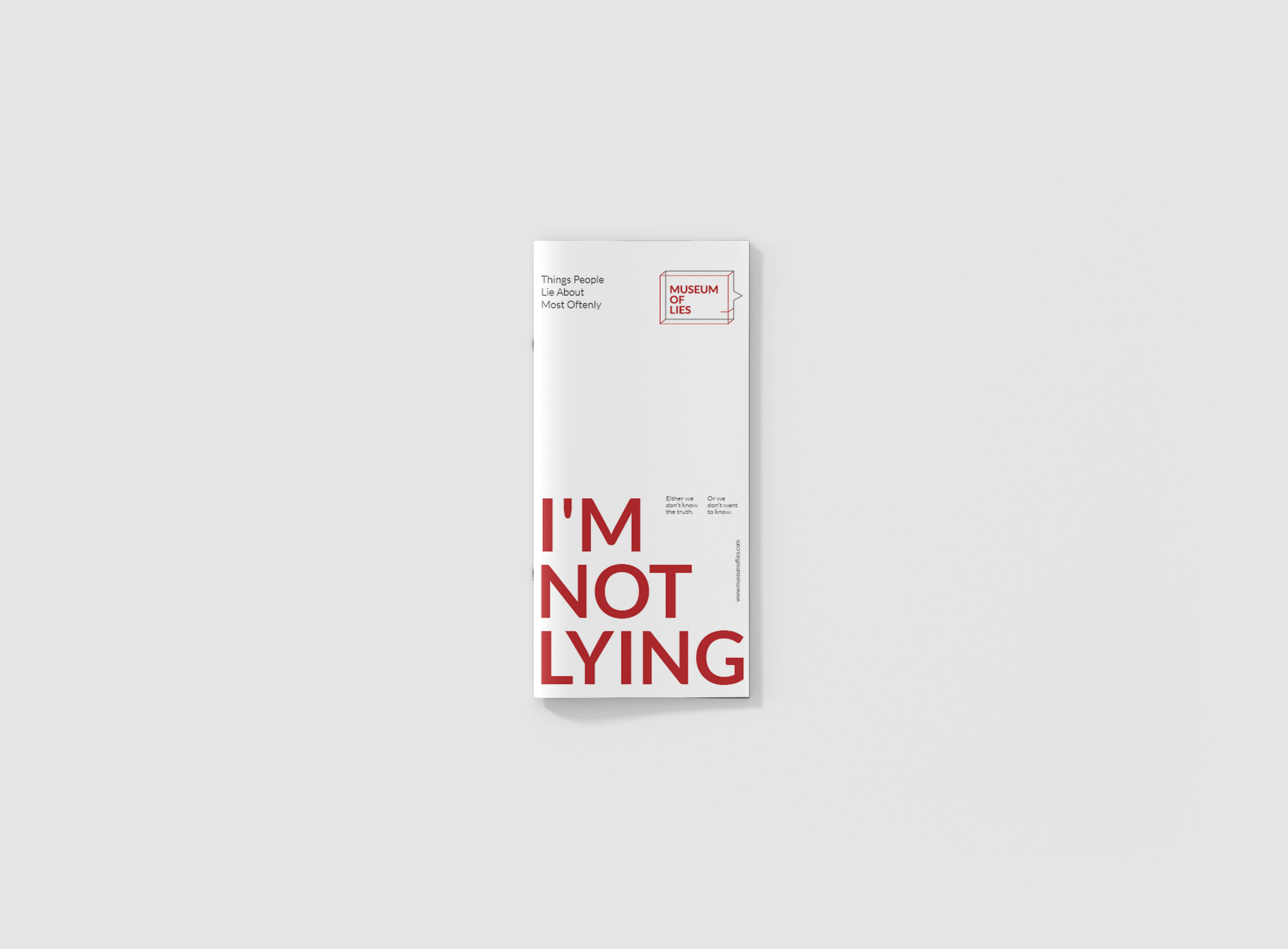
The brochure shows the lies that people tell often.
Information were collected online.
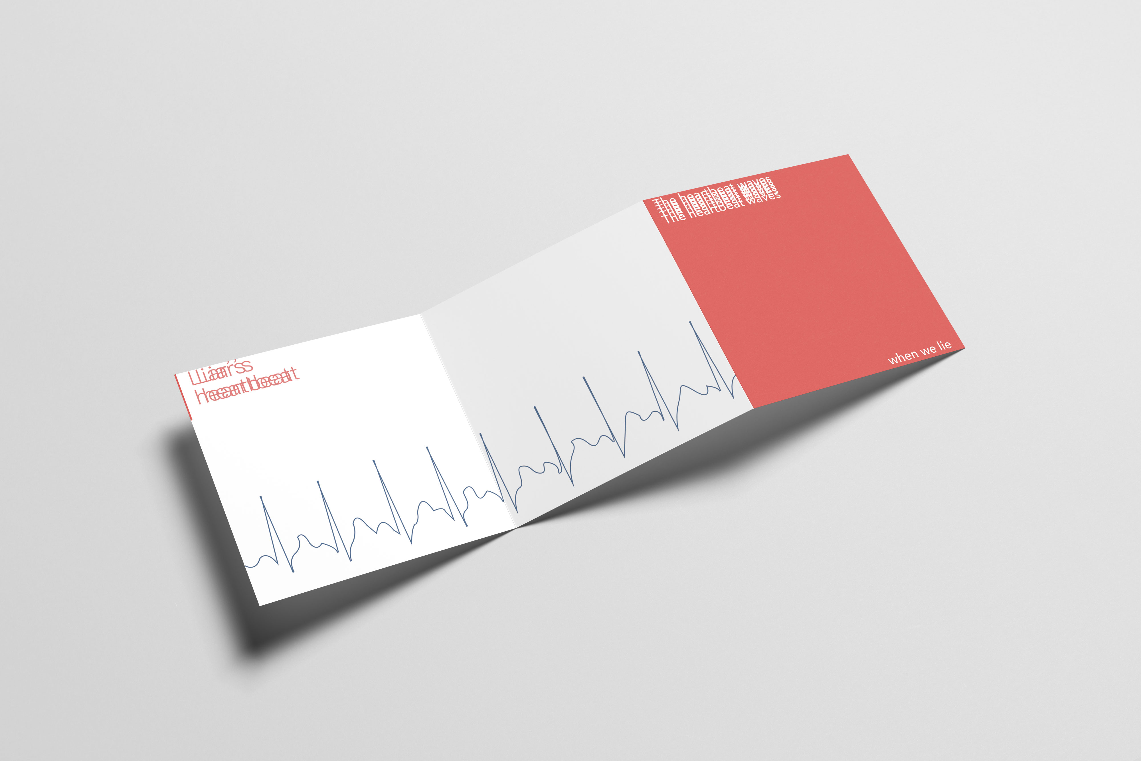
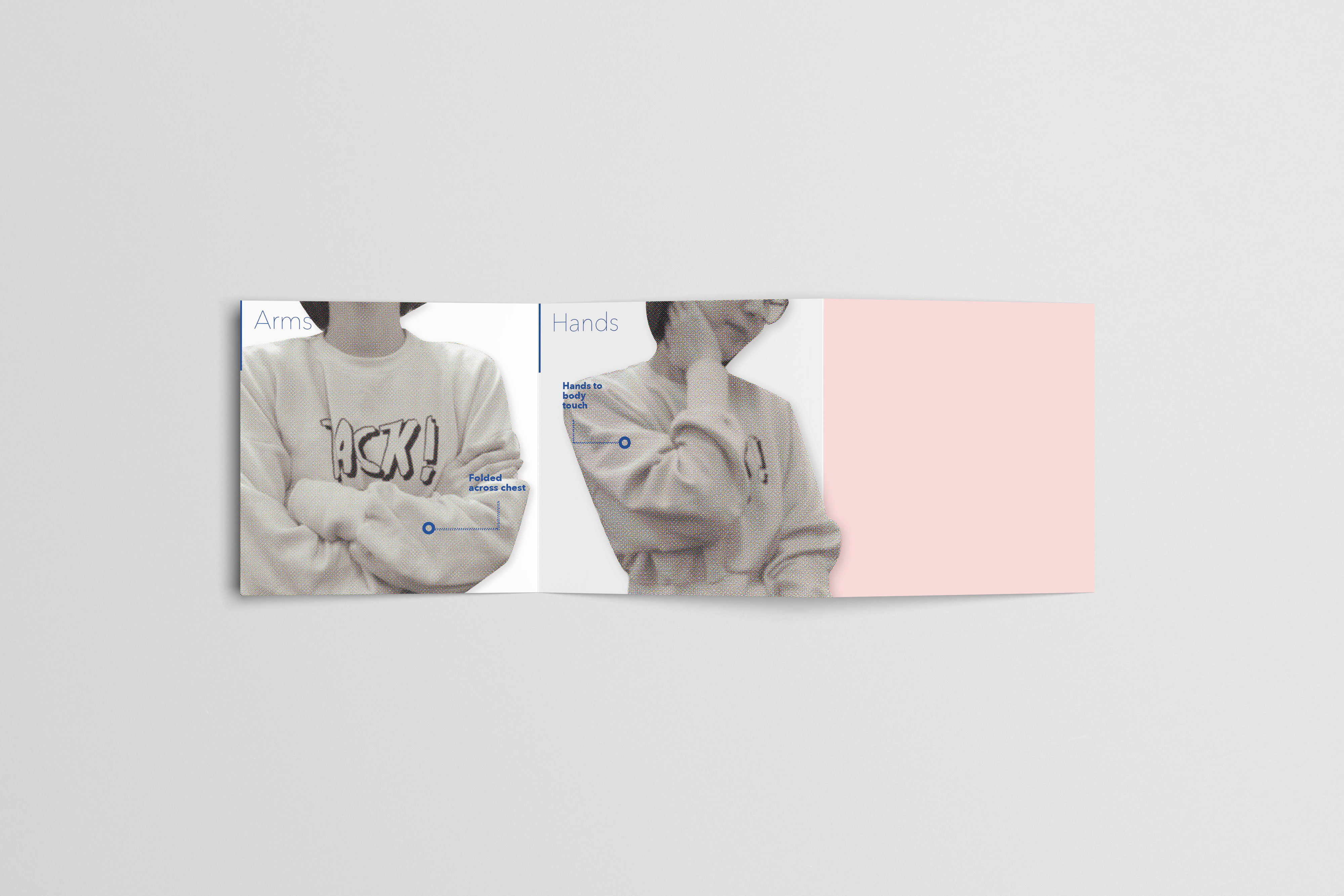
The leaflet
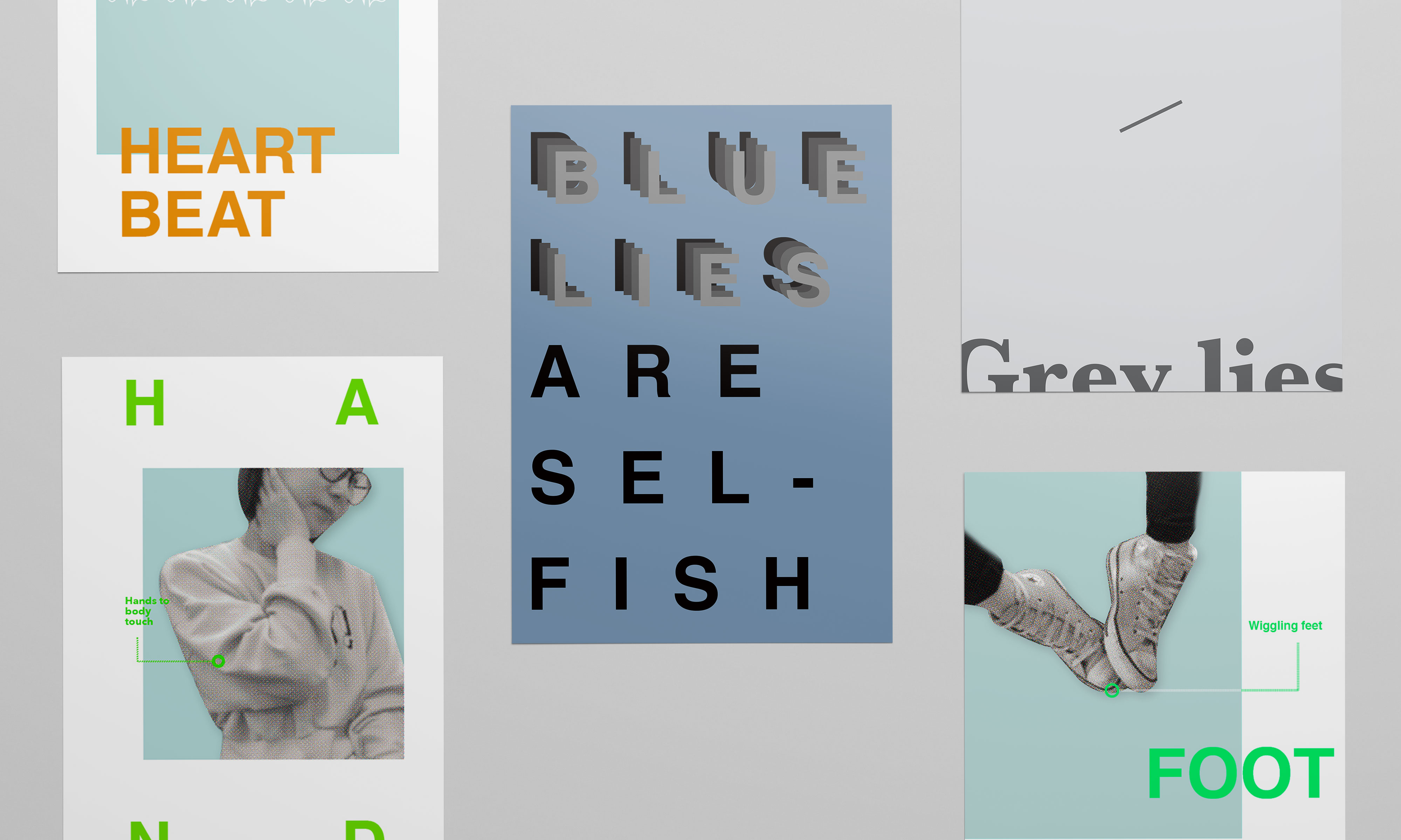
A set of leaflets I designed avove demonstrate the physical reactions when people lie.
The ECG pattern is the imitation which is drawn by hand, in reference to the online documentation of an electrocardiogram, which is used to make a comparison between the normal heartbeat and the liar’s heartbeat.
The ECG pattern is the imitation which is drawn by hand, in reference to the online documentation of an electrocardiogram, which is used to make a comparison between the normal heartbeat and the liar’s heartbeat.
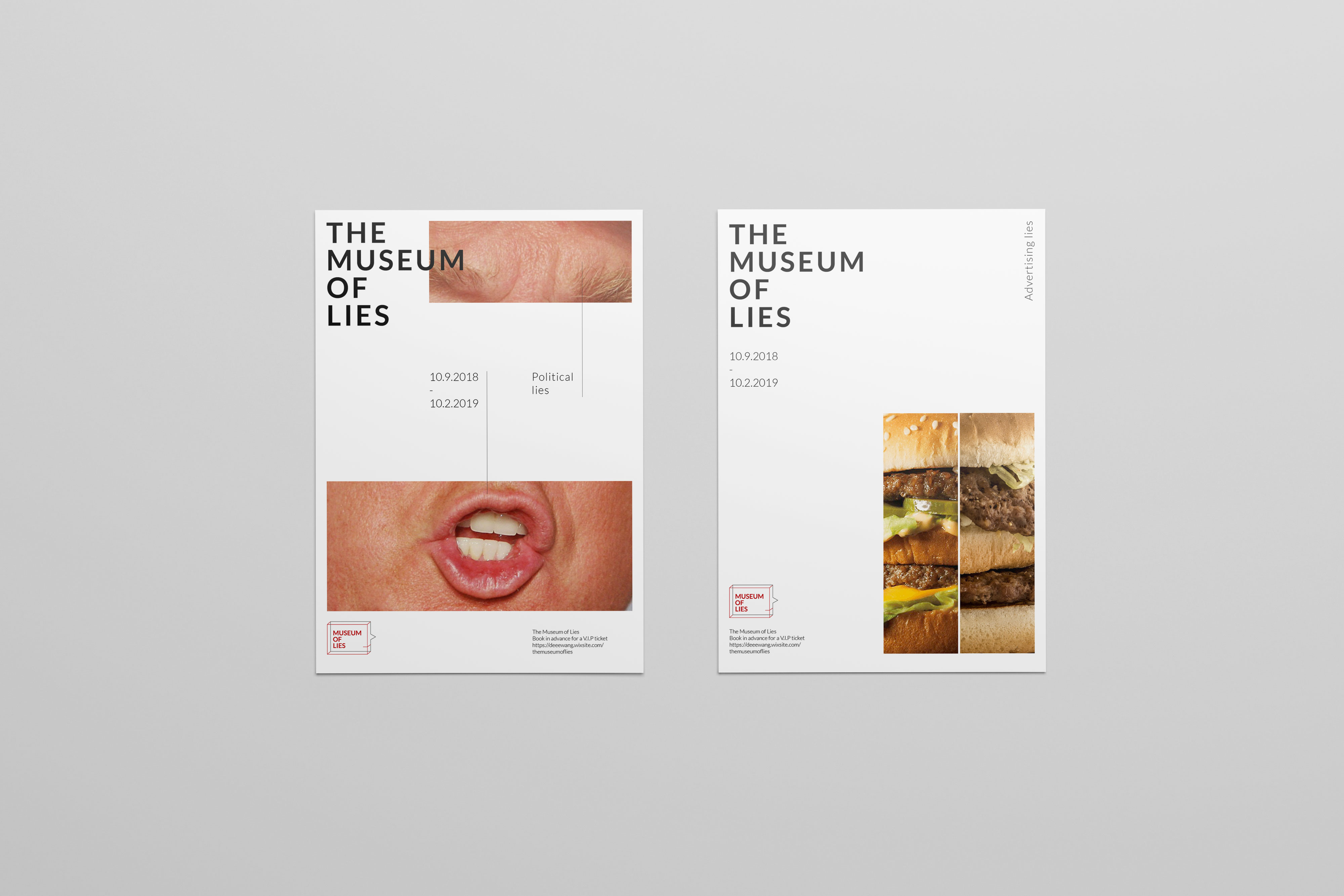

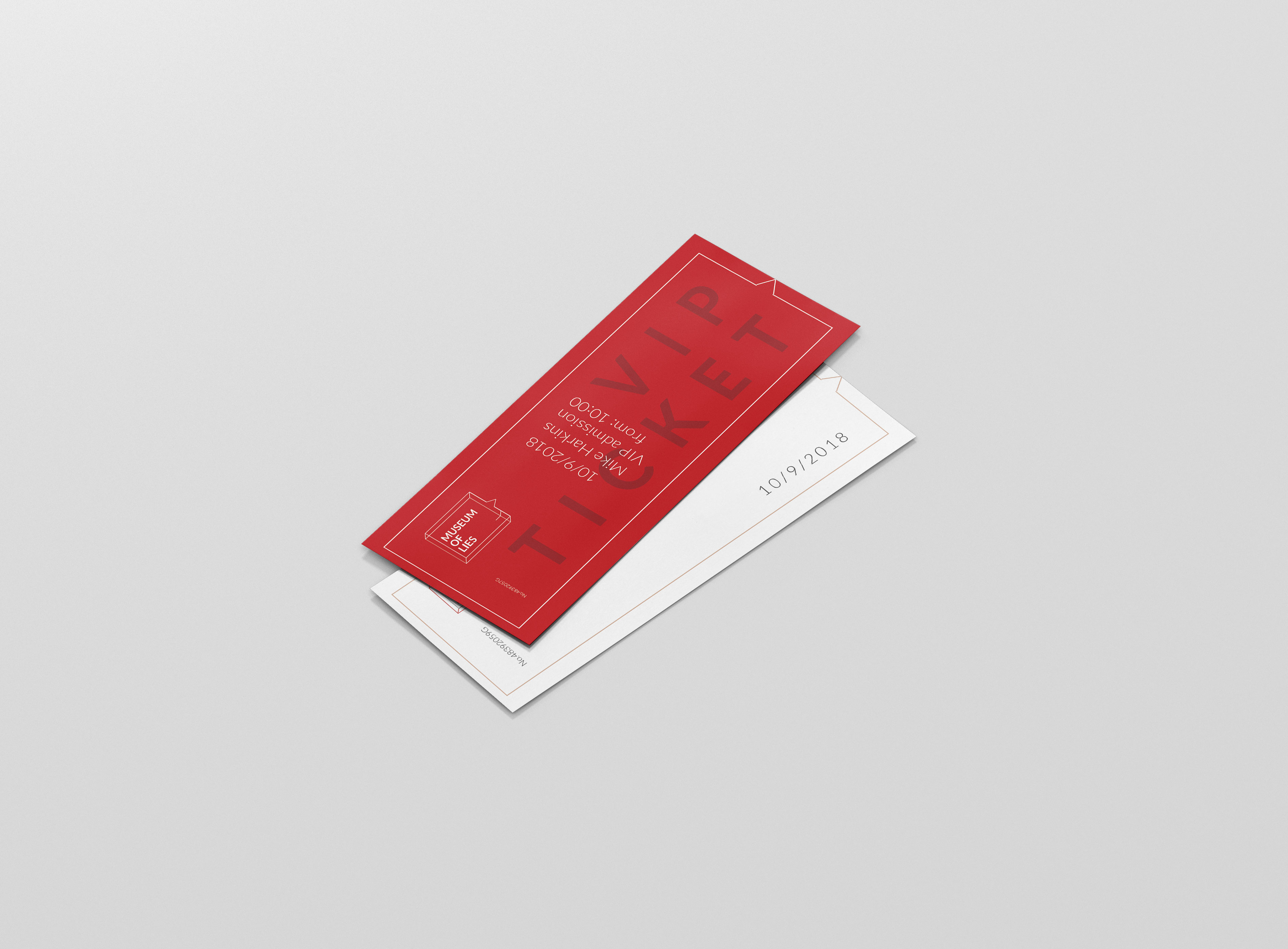
The Posters and tickets
The posters were hanged in public place to test if people did believe there was a Museum of Lies.
The " VIP tickets" were designed and were free for people to pick up.
The " VIP tickets" were designed and were free for people to pick up.
Convincing the public
There were 2 rounds of test taken in London. they were given to 10 random people in Shoreditch. The “volunteers” of the museum of lies were showing the carefully chosen leaflets and posters, asking strangers if they would like to visit this museum.
All of them responded a “yes” and did ask about the exact address which wasn’t shown on the leaflets.
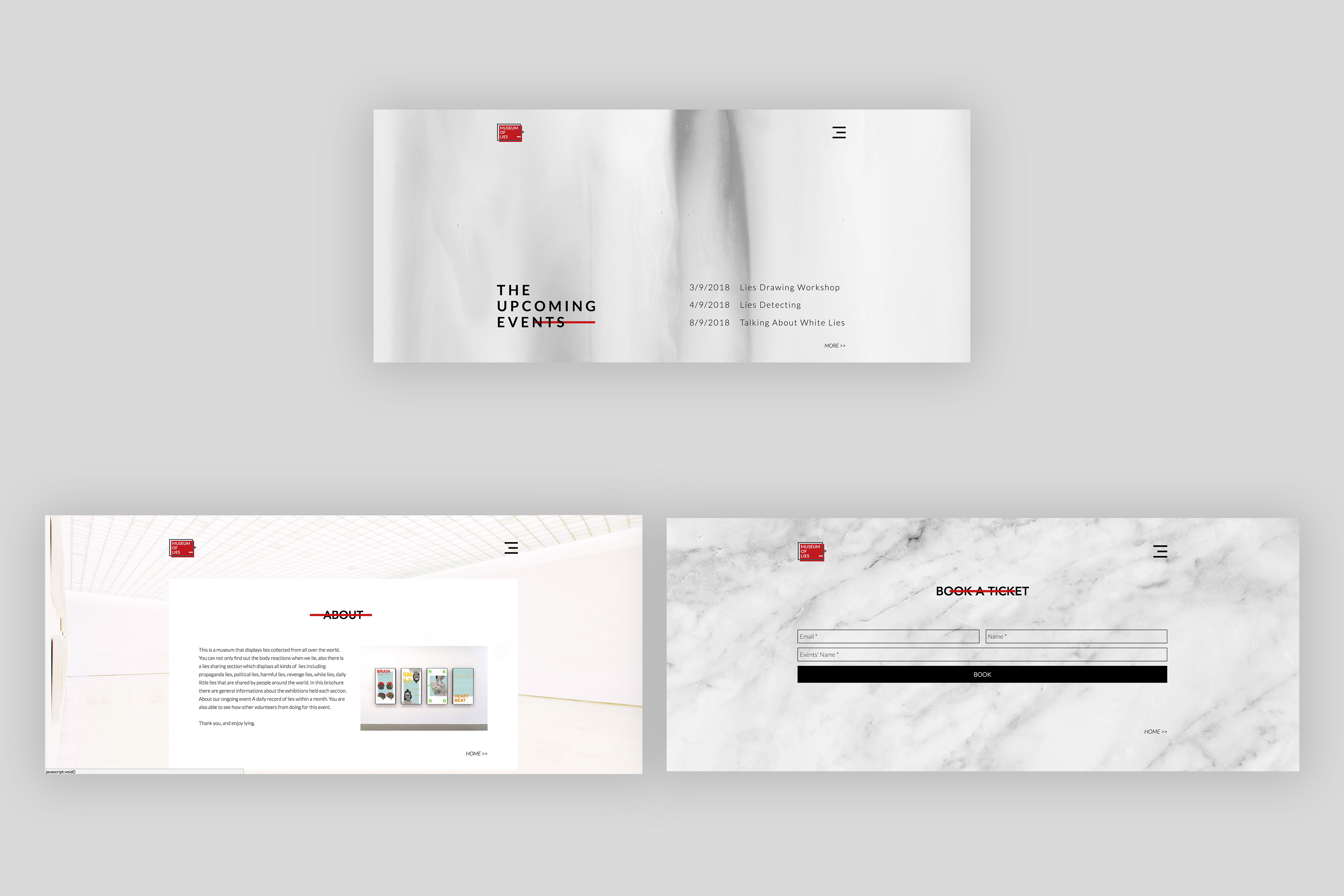
In oder to be convincing, the “volunteers” of the museum of lies explained this is the museum that would be opening soon, meanwhile indicated that the address was on the official website.
All of them responded a “yes” and did ask about the exact address which wasn’t shown on the leaflets.
In oder to be convincing, the “volunteers” of the museum of lies explained this is the museum that would be opening soon, meanwhile indicated that the address was on the official website.
Retrospect
I always believe that telling lies is a controversial issue, I am glad this project has become a biggest lie that i have told in my life, also I have found out in the end that, it is vital to help people confront lies, or social issues with design thinking.
However, it is still an immature outcome so far, as the tacit knowledge in printing skills needs to be improved. Furthermore, the branding part of my project is another weak point. Also if i could have enough time there are still more opportunities to explore deeper in this subject.
However, it is still an immature outcome so far, as the tacit knowledge in printing skills needs to be improved. Furthermore, the branding part of my project is another weak point. Also if i could have enough time there are still more opportunities to explore deeper in this subject.