Introduction
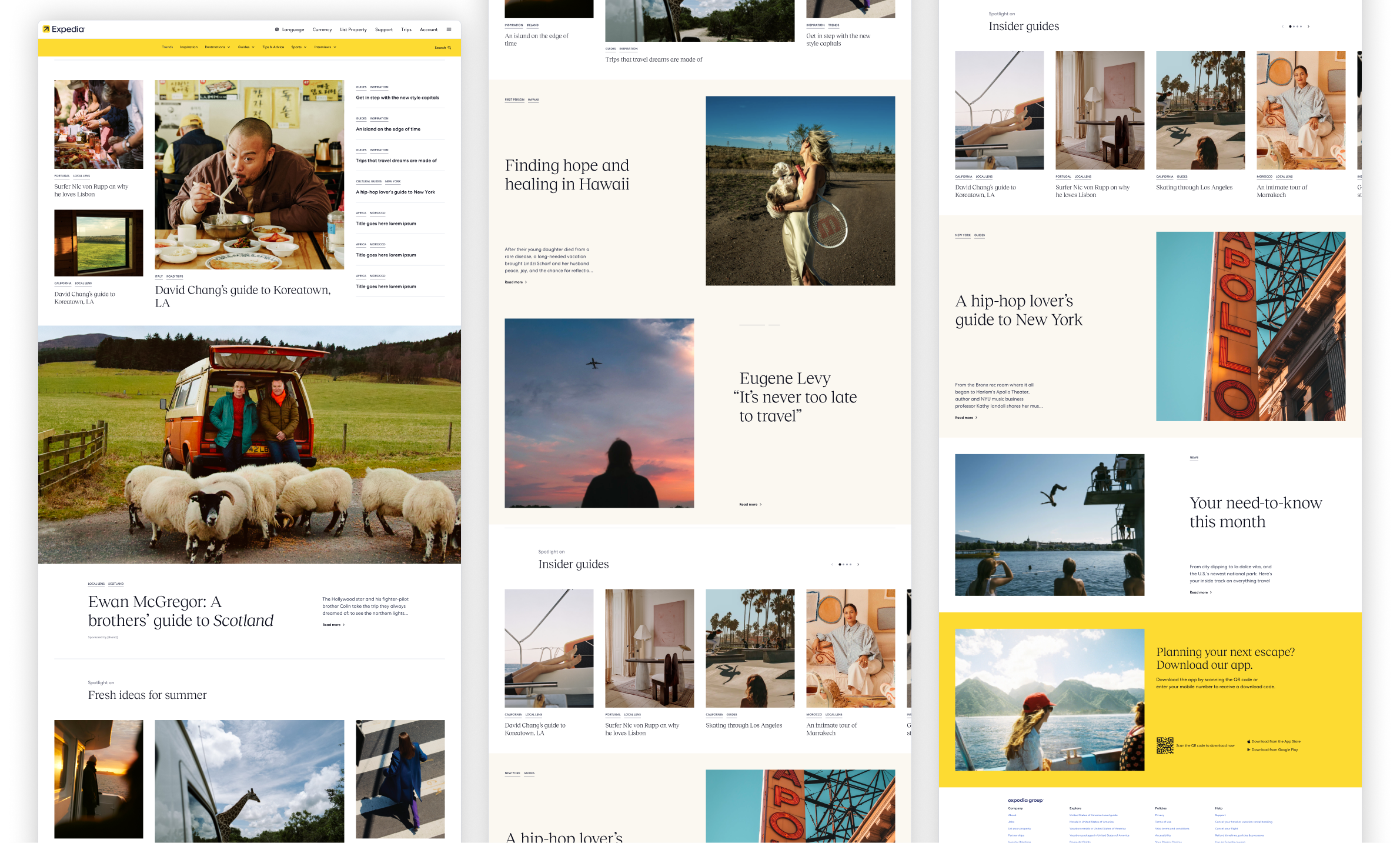
In 2024, Expedia underwent a major rebrand with a new editorial style.
As part of the Media Solutions team—focused on helping travel partners promote their destinations, products, and experiences—I contributed to the rebuild of our design system for Expedia magazine, maily to define functionality and design modules that meet the B2B needs, under brand guideline.
The goal:
1.To align with the new brand guidline and direction
2. Creating reusable components and page templates that could scale across campaigns and platforms
3. Ensuring consistency and flexibility for various partner needs.
My role
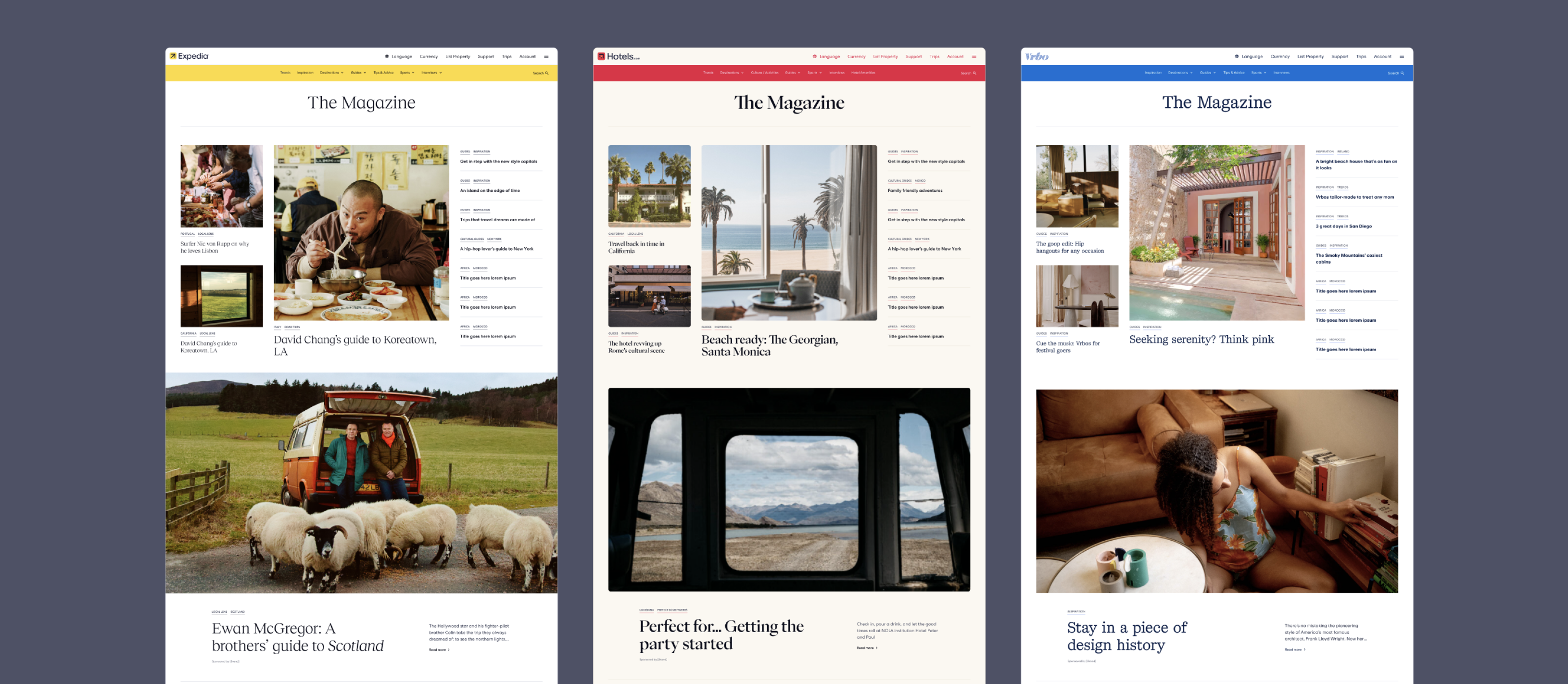
There are 3 brands under Expedia Group, Expedia, hotel.com and Vrbo.
I took part in designing atomic, molecules, modules and page template, with accessibility test.
I also enhanced the design system by resolving issues for travel partners to meed specific business need after it was launched.
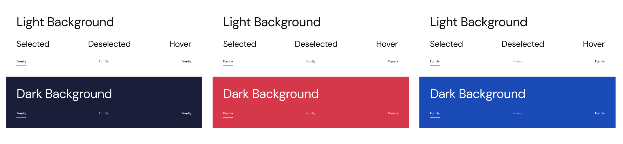
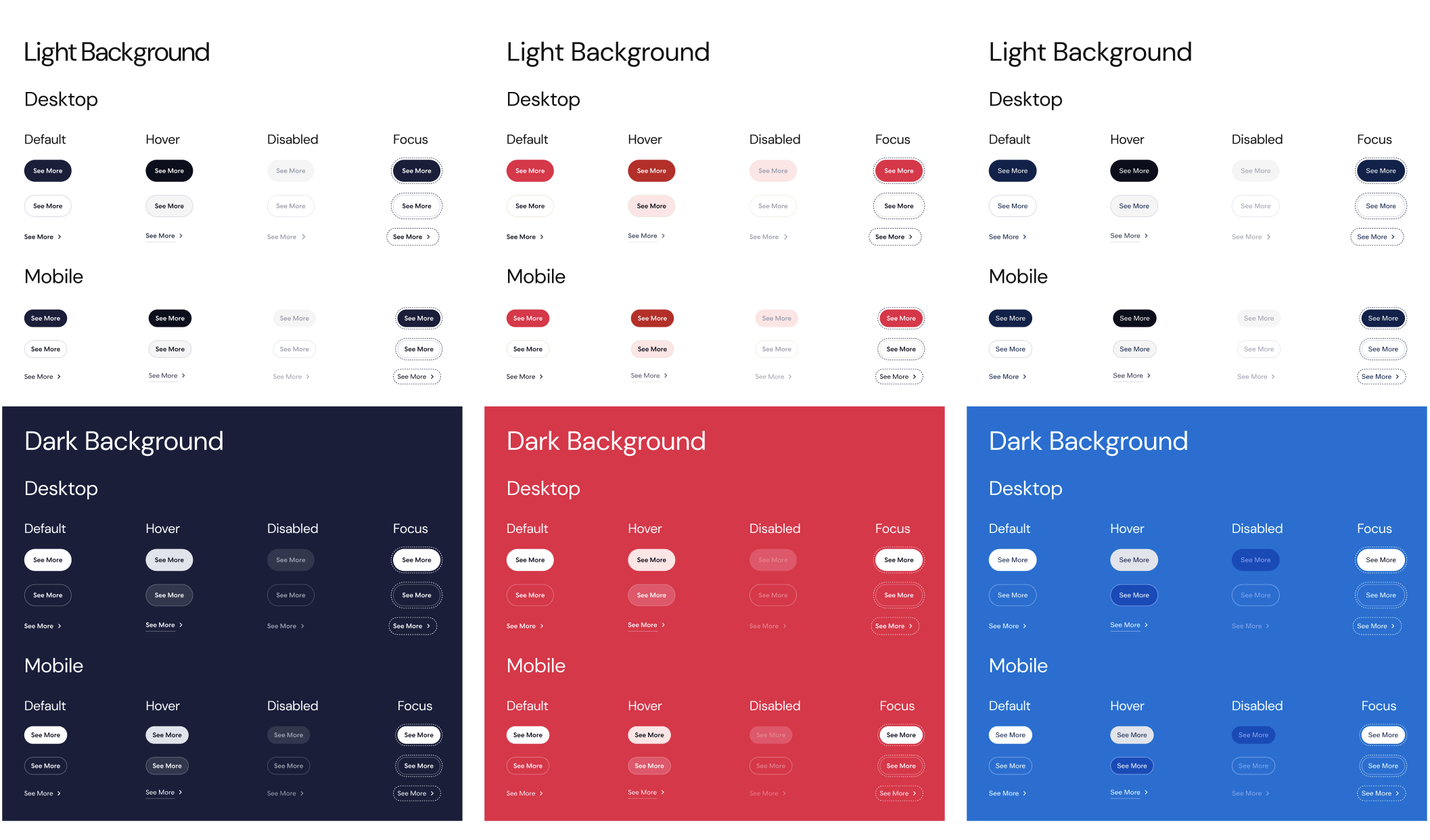
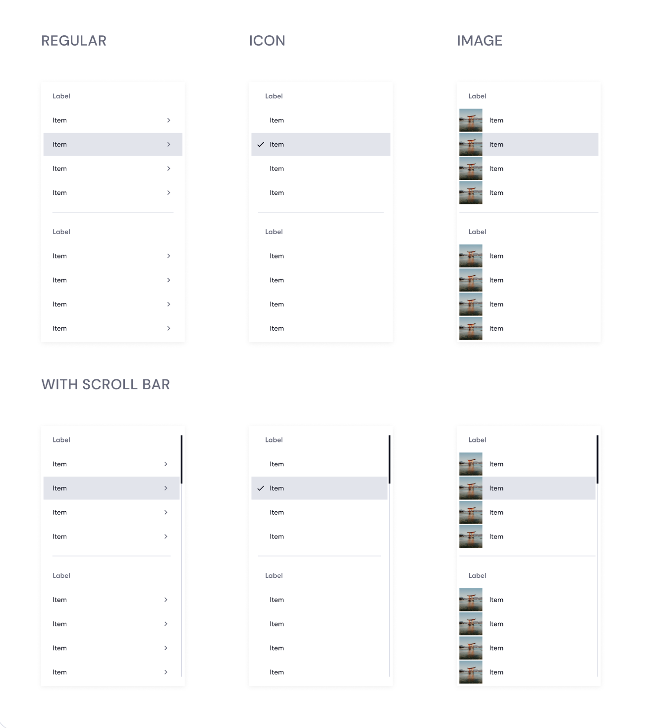
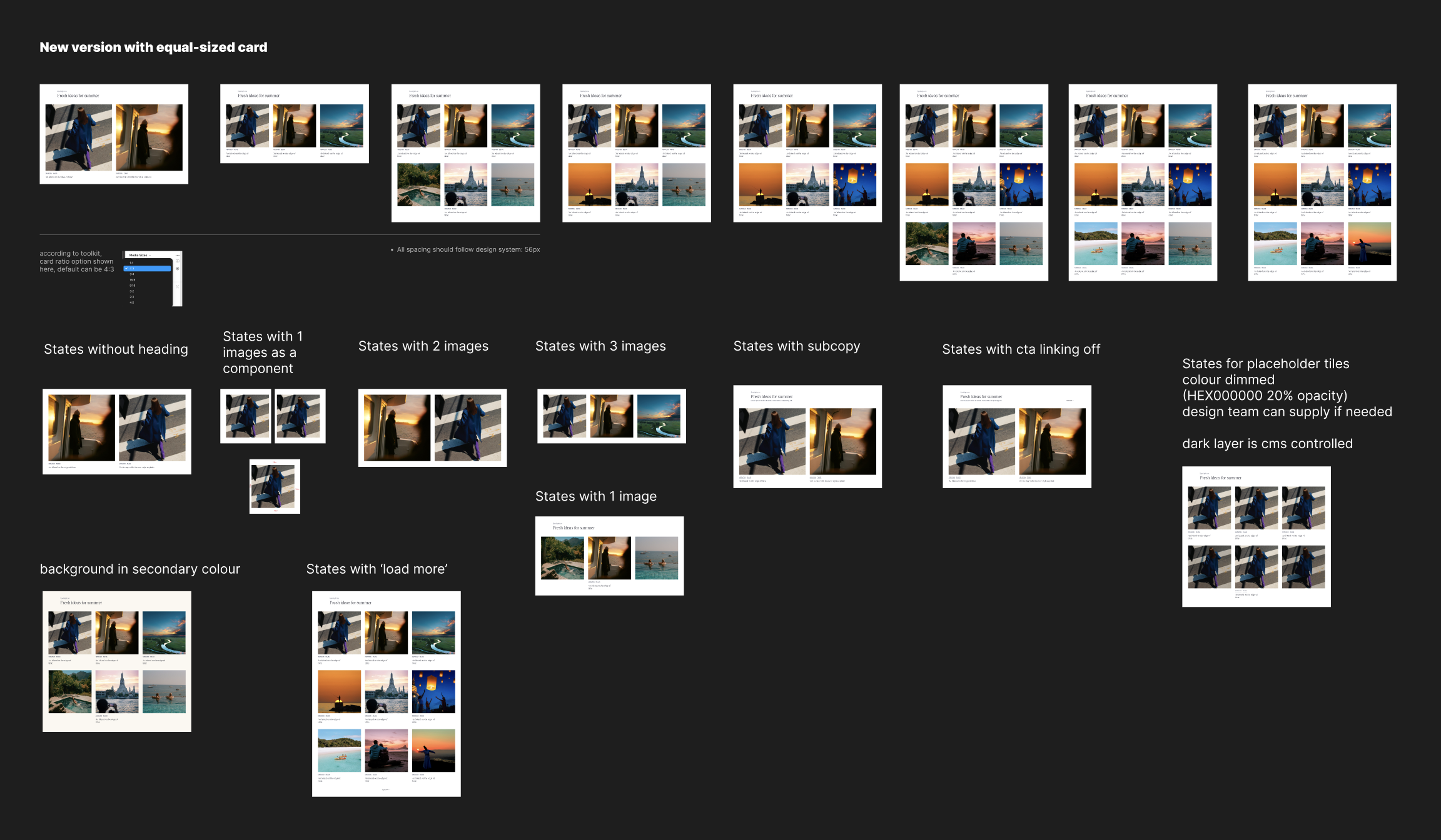
Below are some foundations and atoms i took part in and helped defined (typography and colour varations all designed based on brand guideline)
I took part in designing atomic, molecules, modules and page template, with accessibility test.
I also enhanced the design system by resolving issues for travel partners to meed specific business need after it was launched.
Below are some foundations and atoms i took part in and helped defined (typography and colour varations all designed based on brand guideline)


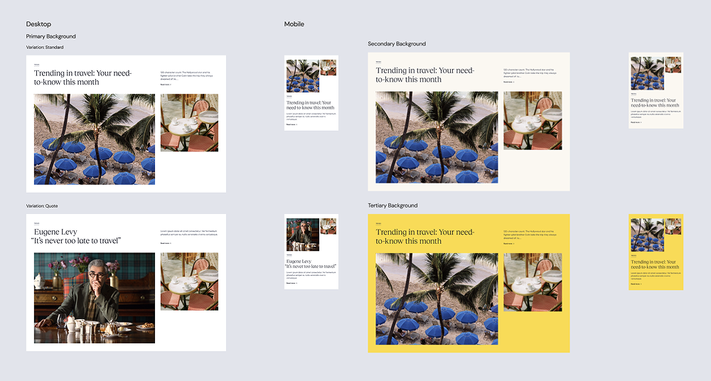
Some modules I designed for marketing team to meet b2b business need.
What travel partners want is simple after working with them closely, they just want a simple heading and copy, but with large beautiful visuals to showcase the resorts, with a CTA driving externally.
What travel partners want is simple after working with them closely, they just want a simple heading and copy, but with large beautiful visuals to showcase the resorts, with a CTA driving externally.
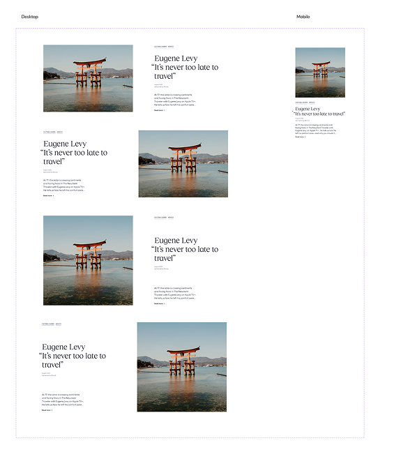
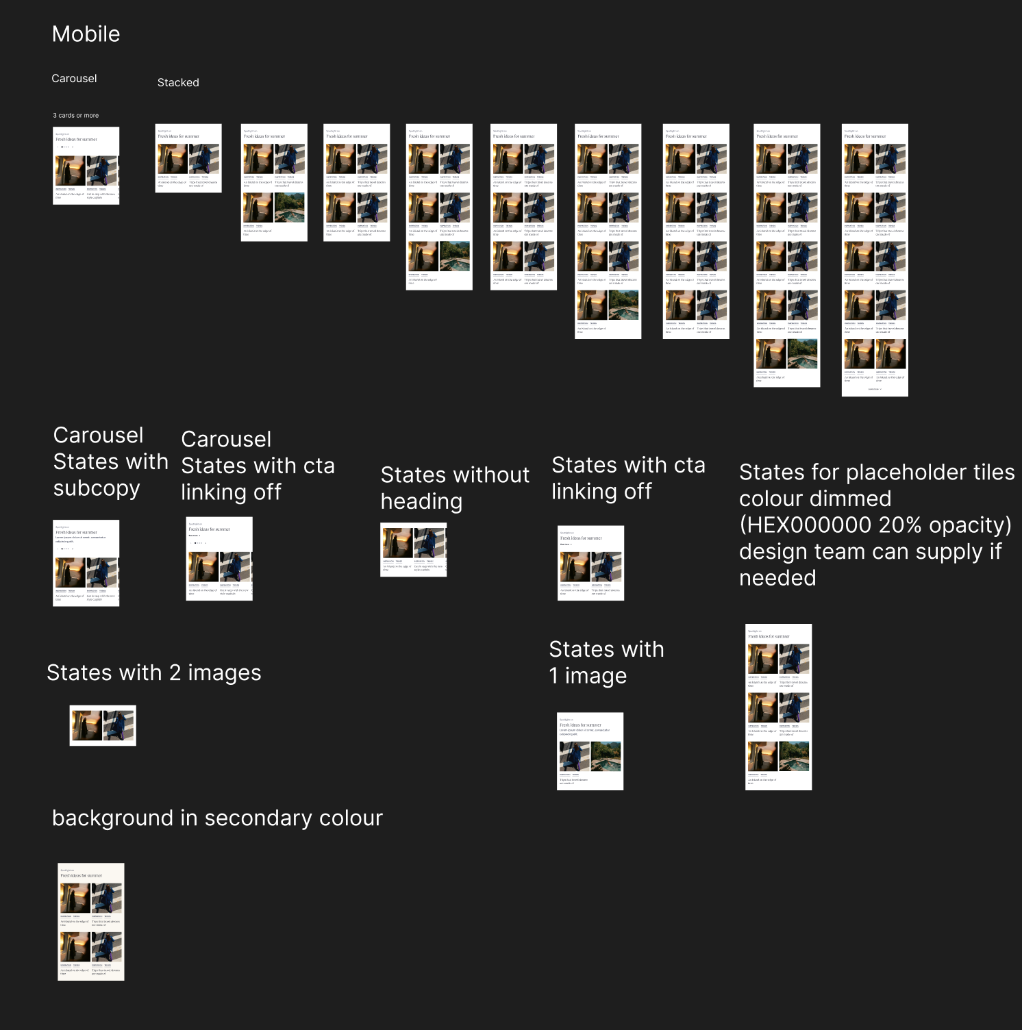
Desktop and mobile
 Hotels and airlines always want simple icons to showcase the amenities and service they can provide.
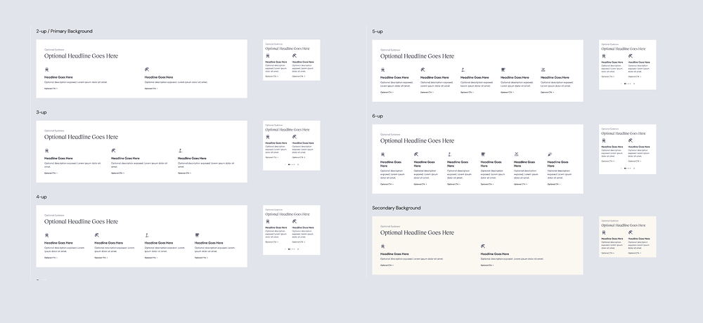
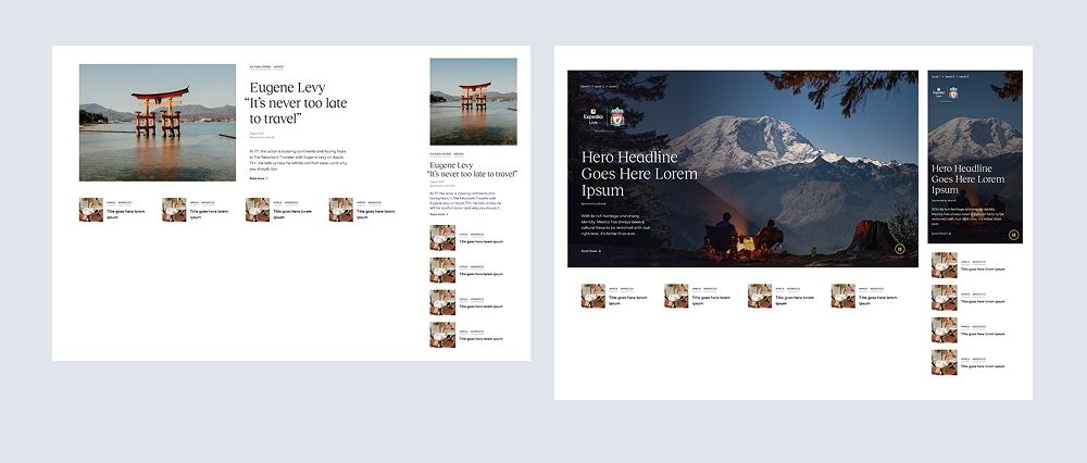
Some Evolved modules I designed for Media studio specifically to enahnce the current modules and prepare to upsell.
Turnaround time: 2 days
Turnaround time: 2 days
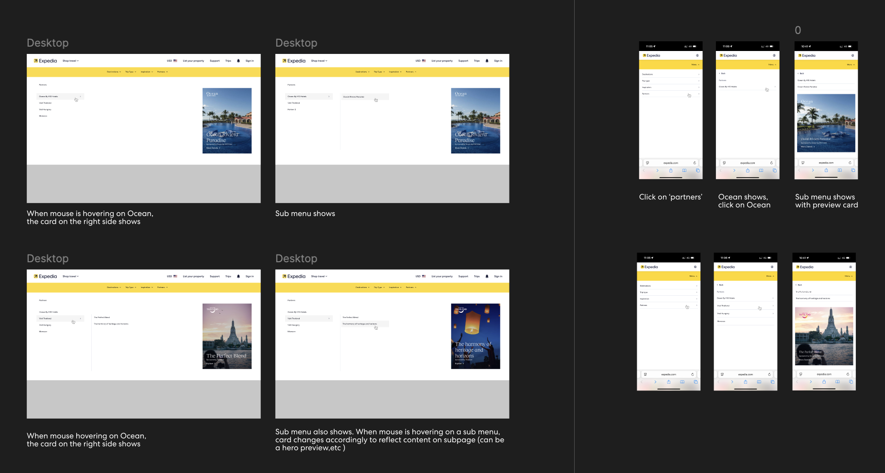
After launching for one month, we noticed that users frequently clicked on the banner, even though it didn’t include a CTA.
I identified this as an opportunity and proposed adding CTAs to the banner to link externally to upsell or sponsored content. These CTAs were designed with multiple states and made controllable via the CMS.
I identified this as an opportunity and proposed adding CTAs to the banner to link externally to upsell or sponsored content. These CTAs were designed with multiple states and made controllable via the CMS.

Same applied here — the initial version had only one static image in the dropdown navigation, which users often tried to click. I turned this into an ad by adding our travel partner’s logo and linking it to specific sponsored content within the magazine.
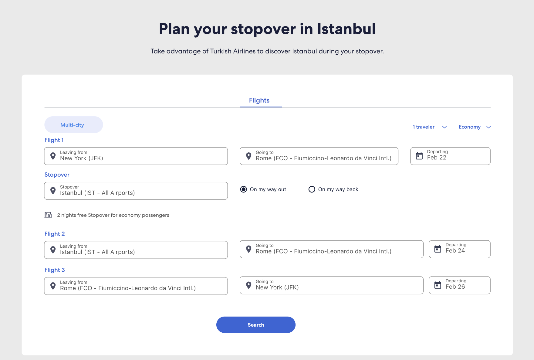
Stopover modules
Old
New: Economy and Business class and mobile user flow enhancement.


New problem - Evolvement
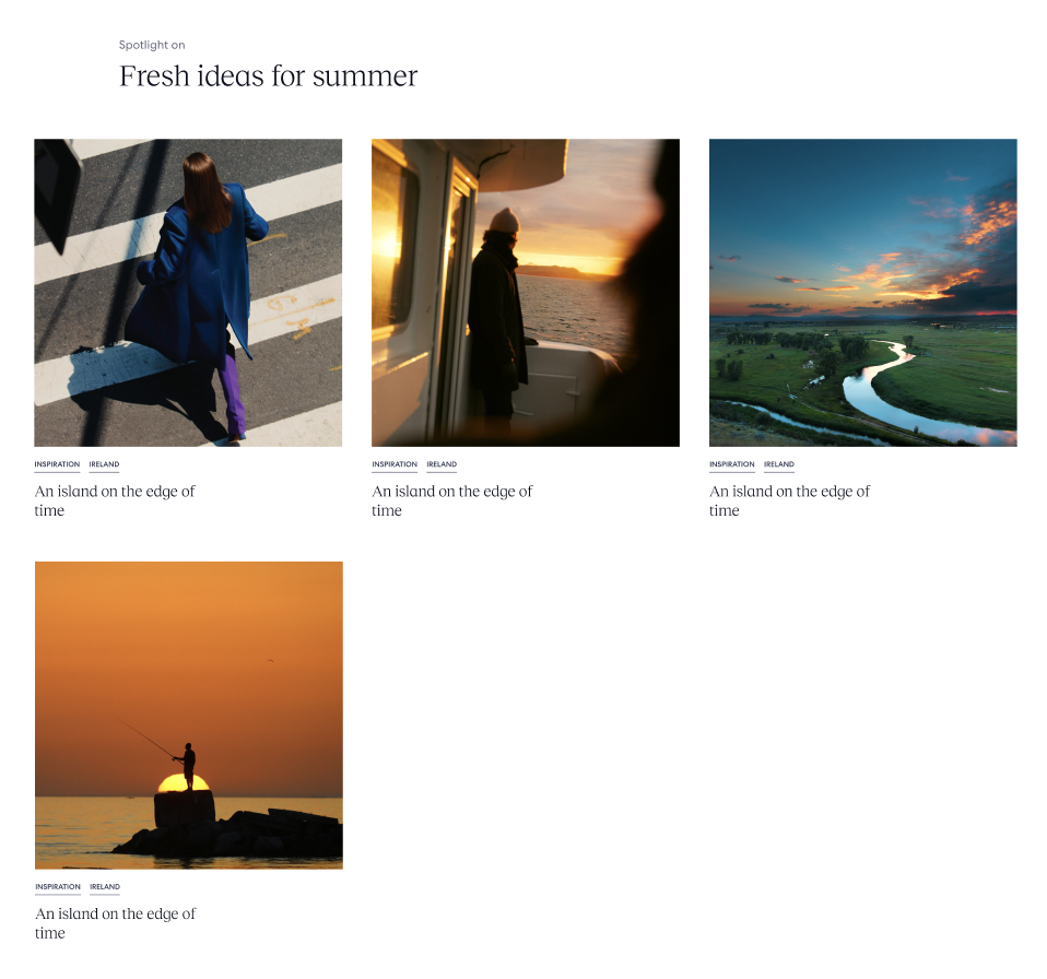
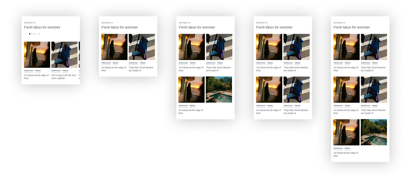
Expedia’s partners purchased ad placements within article content tiles, and one of their key requirements was visual equity — every paid card needed to appear the same size, with no visual hierarchy.
Otherwise, the responsive behavior of the existing cards sometimes caused one placement to render much larger than the others.
When that happened, the oversized card unintentionally dominated attention and overshadowed the smaller paid placements, even though all advertisers had paid the same.
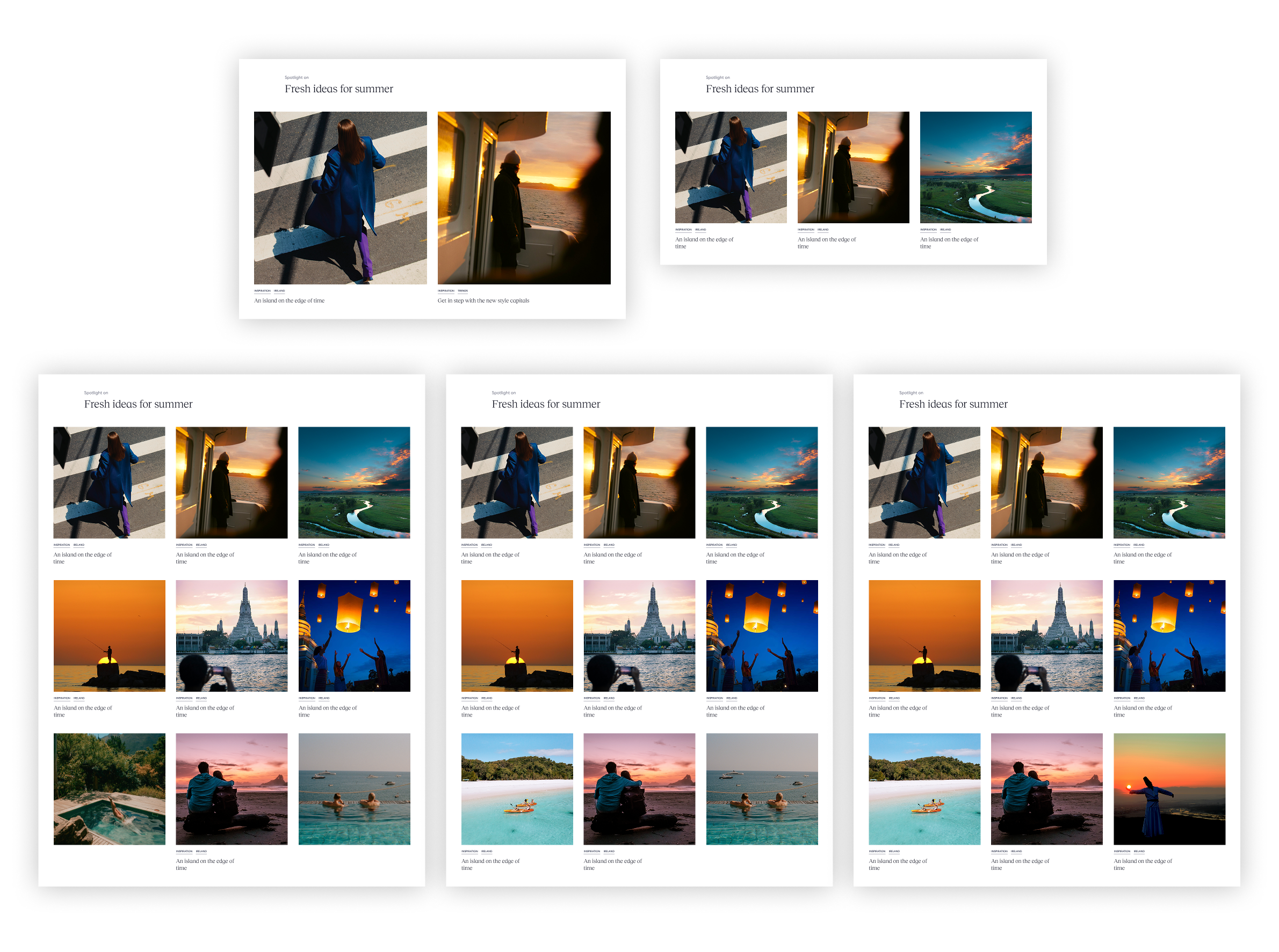
To solve this, I redesigned the layout into a three-column grid that enforces consistent card dimensions across all placements, ensuring fair visibility while remaining fully aligned with the existing design system.
Otherwise, the responsive behavior of the existing cards sometimes caused one placement to render much larger than the others.
When that happened, the oversized card unintentionally dominated attention and overshadowed the smaller paid placements, even though all advertisers had paid the same.
To solve this, I redesigned the layout into a three-column grid that enforces consistent card dimensions across all placements, ensuring fair visibility while remaining fully aligned with the existing design system.
Challenges
1. Uneven Card Count
When the number of cards isn’t divisible by three, the final row can end up with only one or two cards—creating unbalanced whitespace and compromising the polished, premium look expected by our partners.
Unbalanced card shown below:
![]()
2. Tight Deadline
The turnaround time for this project was just 3 working days, making it critical to quickly test, validate, and finalize a scalable solution.
When the number of cards isn’t divisible by three, the final row can end up with only one or two cards—creating unbalanced whitespace and compromising the polished, premium look expected by our partners.
Unbalanced card shown below:
2. Tight Deadline
The turnaround time for this project was just 3 working days, making it critical to quickly test, validate, and finalize a scalable solution.
Solution
To resolve the issue of uneven final rows while maintaining the grid structure and partner expectations.
1. I conducted quick design tests to evaluate which approach looked the most balanced across breakpoints and partner use cases.
2. Then proposed a clean and scalable solution:
After conducting quick design tests and stakeholder reviews, this solution was implemented successfully and preserved both the aesthetic and business goals.
1. I conducted quick design tests to evaluate which approach looked the most balanced across breakpoints and partner use cases.
2. Then proposed a clean and scalable solution:
-
When the last row has fewer than 3 cards, the clickable sponsor card is centred.
-
I added two dimmed placeholder tiles on either side to maintain layout integrity.
-
These placeholders are non-interactive and visually de-emphasised with a black overlay at 20% opacity (HEX #000000, 20%).
- The visibility of these placeholders is CMS-controlled, giving the content team flexibility without needing design input for every update.
After conducting quick design tests and stakeholder reviews, this solution was implemented successfully and preserved both the aesthetic and business goals.

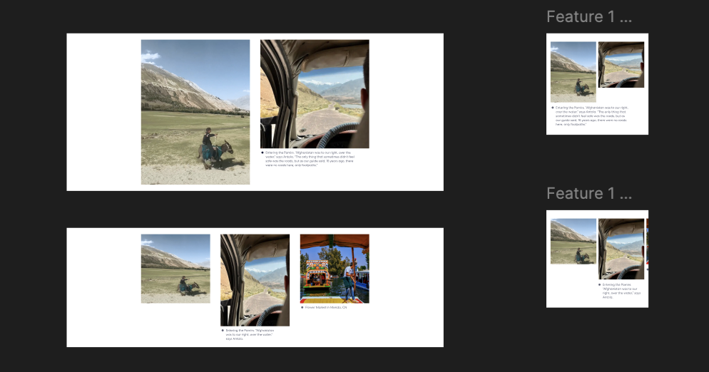
Creative solution
Premium Editorial Tile concept for upsell
To offer more flexibility and editorial value, I also proposed a premium panoramic tile format:
![]()
To offer more flexibility and editorial value, I also proposed a premium panoramic tile format:
- A single panoramic photo spans the width of all 3 grid columns.
- Each tile section within the panoramic image can be made individually clickable, linking out to the same subpages or external pages.
- This layout can serve both as an editorial storytelling element and a sponsorship upsell opportunity, elevating partner content within the layout.

Full solution
Mobile solution
Carousel and stacked
Result
The solution was well received, launched on time with the partner, and praised for both meeting the deadline and maintaining high quality.
Page template